
Recommended
More Related Content
What's hot
What's hot (20)
Similar to Brand guidelines
Similar to Brand guidelines (20)
More from hanaa_m
More from hanaa_m (20)
Recently uploaded
Recently uploaded (20)
Brand guidelines
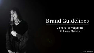
- 1. Brand Guidelines V (Vocals) Magazine R&B Music Magazine Clara Barroso
- 2. Music MagazineThis is the final look for my R&B final magazine, exported into JPEGS:
- 3. Cover Lines For my music magazine I feel like the amount of cover lines I’ve included on the front cover are equally and fairly similar to the same amount, just like any other music magazine. Through my research and my progress of finding a front cover magazine to analyse, I came across the Vibe music magazine, which is a R&B music magazine, so I tried to get and inspired as possible to have similar codes and conventions just like a R&B magazine, which at this point it would be Vibe music magazine. Vibe music magazine usually have a lot of cover lines to attract as most of the primary and secondary audiences attention as they can possibly can. They usually have two columns on both sides of the magazine. That’s exactly what I did for my magazine cover lines. One column is longer than the other, which is looks effective and it looks like it’s done for a purpose. In total I have nine individual little titles/ headings on my cover lines for different things that are spoken inside my music magazine. In order to make my magazine look professional and decent to attract my primary and secondary audiences I decided to use a very modern font for my whole magazine. However I still wanted my magazine to fit the codes and conventions of an R&B music magazine, that was when I added the classic font to my first article page when it came to talk about the artist. My cover lines gives the idea and the look that even thou it’s just on the idea based about R&B music genre, my magazine has a very specific modern look to attract my audiences attention for them to share online.
- 4. Colour Scheme The colour scheme for my magazine, I chose a combination of three colours that would relate to my primary (females) and my secondary (males) audience equally and fairly, even though my magazine would have more female readers than male readers. Not matter the model on the main image on the front cover or whoever the article is about, male or female R&B artist the colour scheme for my magazine would always be the same, so the audience can recognize the magazine by the use of neutral colour combination on front cover and the magazine would be equally dedicated to primary and secondary audiences. The use of the colour gold really reflects on the idea of being just based on R&B and being really focused on only R&B artists and music in general. Gold is the one colour that would make my magazine stand out and it would give the idea to the audience that this magazine genre in only about R&B. Also, the idea of the use of the gold colour stands out from all the other magazines, especially if my magazine would have been to be sold as a hard copy magazine besides of only being able to read online. From my research that I did before I started to create my magazine, my magazine would be the first magazine(out of all the music magazines) to use the colour gold as one of the colour combinations for the colour scheme, for the magazine to be recognized. The use of the colour, black and white would be for the idea of being balanced with the rest of the magazine and for the use if the black and white photography throughout the magazine. Accept the front cover which is one of the pages that had colour but the use of the colour scheme follows on it follows with the rest of the magazine which is mainly all in black and white.
- 5. Tone Personally, I think my magazine is an magazine appropriate for only the older teenagers/ adults as my magazine wouldn’t be suitable for anyone else that is younger than that because of the se of the R&B artists/ bands and the particular music that they right. That’s what I would say my magazine over all. However, because my first magazine issue involves a good artist she would be appropriate for teenagers, but maybe not younger than the age of 17 years old (females and males). I would also say that my magazine is a pure R&B magazine, not just by the use of the colour schemes but also the artists that are chosen and featured on my magazine and to keep the R&B genre on my magazine as visible as possible to the audience and easy for the target audience to get influenced by. With this I mean the idea of the use of poses that the model is portraying through the magazine, which would make her seem as ‘cool’ for some poses and for other poses she would be portraying ‘sexy’ or even ‘diva’. As the article and the Q&A was written and answered on an informal way. The audience would most likely to read the article and to feel some sort of connection between the artist and the magazine itself, they would start using the magazine as a personal and identity purpose, which would link to the uses and gratifications. The tone through the whole magazine, has an R&B vibe, which allows for the audience to identify the magazine easily but also for the magazine itself to recognize the primary and the secondary audience of the magazine really easily. My music magazine would have a lot included on each issue has, the magazine is only published monthly.
- 6. Conclusion Overall, I feel that my magazine brand can e recognised by the particular use of the colour scheme, of the colours; black, gold and white. It’s a colour scheme combination of neutral colours which makes my magazine, equally aimed at the females from my primary audience and also at the makes from my secondary audience. I made clear through my magazine that the colour black, white and gold are the main colours, especially gold, which is more commonly used through every page of my magazine. Also the idea that my magazine is unique in it’s own way by the use of the gold, which is a common colour that you don’t see a use off in any other magazines that are published, so my target audience can easily associate with my magazine. Also the use of modern fonts and the use of signatures through my magazine on a numerous number of page, it still makes it look mature and representable for my target audience, both of them (primary and secondary audience) and for also the genre that my magazine is based on, which is R&B, which is exactly the way I want my magazine to appear so my target audience can expand even more.