1. The three main colours used on
this magazine cover are pink,
white and black. The masthead
is in pink showing that it is a
female magazine, and attracts
its target audience of teenage
girls. The sell lines around the
magazine are in the same shade
of pink and white.
Colour palettes
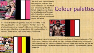
The house style of this magazine is black red and white. These
colours put together are very masculine therefore makes the
target audience mainly males of mid teens, to mid twenty’s. The
red connotes either love or danger, but in this case I would say it
connotes danger as the main image is very intimidating.
This magazine is a rock/metal genre therefore includes all the expected colours. The
main colours are white, red, yellow and black. Yellow and black are the same colours
used on a warning sign therefore together connotes danger and ‘beware’ and the red
also connotes danger. The white makes the writing stand out against the red, yellow
and black.
2. Colour Palettes for my Magazine!
These are the main colours I am going to use for my classical
music magazine as I think they are appropriate of my target
audience which is males and females aged 30-60. They are also
‘pure colours’ which connote the purity of classical music.