
Recommended
More Related Content
What's hot
What's hot (20)
Similar to Analysis of 2 Music Magazines
Similar to Analysis of 2 Music Magazines (20)
More from emilylacey16
Recently uploaded
Recently uploaded (20)
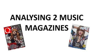
Analysis of 2 Music Magazines
- 2. Serif fonts are used for a few of the coverlines. This makes the text easier to follow because the serifs on the letters act as a line for the text to be on. Sans serif fonts are used for the rest of the text on the front cover and are often bold. Sans serif fonts are often thought of as tidier and more modern looking which could appeal to the target audience more. The colour red is a colour that's easy to see at all times because it's very bright colour. It is often used to bring forward text and images. People generally have a quick response to the colour red which is why it's a good idea using it on the front cover of a magazine because it means, as it catches their eye, they'll have a fast reaction to it and could pick it up and look at it. The masthead is very big and stands out so it would be easy to see from a distance. It's also very simple and easy to distinguish from other magazines. The puff is a different colour to all but one of the coverlines. This makes it stand out from the rest of the page and draws attention to it. The fact it's the same colour as one of the coverlines suggests that they are related to each other. It's the perfect size as it's not big enough to draw attention away from the image or the coverlines, but it's big enough to catch the eye. The coverlines are white and bold which causes them to stand out and allows people to be able to read them without being close to the magazine. Also, the coverlines don't make it immediately obvious as to what the stories are about which would cause people to pick up the magazine and read the front to find out what's inside. The main image is a photo of Florence and The Machine reaching out towards and looking directly at the camera. This is an example of direct address and can draw in the target audience because they feel personally addressed by her. This also shows that the cover story is about her and it informs the readers what they can expect to read about in the magazine. The way she's styled in this photo looks casual but stylish. For example, her hair is curled loosely and she's wearing an unbuttoned plain shirt with an unbuttoned jacket. This makes could make the readers relate more to her because she appears more as a 'normal' person rather than a celebrity. This magazine is designed to appeal to people who like all sorts of music genres but this issue is specifically for fans of indie rock music. It represents the readers interests by using an image of a popular indie rock artist. The kind of readers that are not addressed are people who like hip-hop and rap music or really popular dance/rave music. They aren't addressed because this issue is focusing on indie rock music which is stated clearly by the main image and the coverline that says "indie rock" very large at the top. This wouldn't appeal to people not in the target audience. This cover shows a good indication of what's inside. For example, all the artists mentioned on the cover are included in the magazine. The language used in the coverlines is very simple. For example, a lot of the coverlines are just artists names. While this doesn't give information about the stories, it does tell the audience which artists they can expect to read about in this issue and they can decide whether or not it appeals to them. Also, using simple language like this wont lose people's interest straight away.
- 3. The colour black denotes strength and is often thought of as a very formal colour. it's also used to create contrast. There are lots of different colours on the page. This is done to catch the reader's eye and to stand out from the picture and the plain white background. The white and red from the front cover have been carried over onto the contents page. This establishes a sense of brand identity. There are a variety of images relating to the contents. This keeps the page from being boring and allows the reader to see what the stories are about without having to read much. This lets them instantly see and choose what appeals to them and which story to read instead of having to read very word on the page. The contents are just the name of the artists which allows readers to see the artist's name they want to read about and find the story straight away. The contents are bold and bigger than the rest of the text on the page, this makes them stand out and are the first thing people would read on the page. This contents page gives a good indication of what's inside this issue of the magazine. This is done by the use of photos to represent what the audience would be interested in. Also, the use of the artists names as the titles of the contents is a really simple way of letting the readers know what stories are about who. The language used is what people who are big fans of music and listen to it often would use and understand. The words used aren't long and difficult to understand but slang isn't used. The 'Q' logo is on both pages of contents. This maintains the brand identity and reminds the reader what magazine they're reading. The fonts for the title and the contents are bold sans serif. This makes them stand out from all the other text on the page. The rest of the text on the page is serif. This makes it easier for the reader to follow as the serifs act like a line for the text to be on.
- 4. The colour scheme of red and white has been carried over onto the double page spread from the front cover and the contents page and it ties all pages together while maintaining the brand identity. The main text is serif which makes it easier to follow because the serifs make it more like reading along a line. The title is big, bold and white. This makes it stand out from the image. The title doesn't give exact information about the story which would make the readers curious and lead them to read the whole article. The title is bold and stands out this makes it visible from a distance. This also makes it clear that it's the title and it tells the readers what the story is about The pull quote is also bigger and a different colour to it's background which makes it stand out and suggests it's an important part of the interview that they want the readers to know about The Q&A section is a different colour from the main text. This makes it stand out. It lets the reader know that they can read that section if they want to find out shorter things about the artist without reading the whole article if they don't want to or don't have time to. The photos used on this page all relate to the article and are interesting to look at. This engages the audience in what they're reading and looking at as it grabs their attention. This is also done by having one image significantly larger than the other two so it leads the reader to look more at the page. The photos are also what the audience would expect to see on an article like this. This magazine is published by Bauer Media Group. They publish lots of other magazines including Kerrang. They also own many radio stations including Absolute Radio.
- 5. Masthead is at the top right corner and is covering part of Taylor Swift's head. This could have been done instead of putting it behind her head to make people more aware of what magazine it is. There is only one coverline which is big and stands out from it's background. It would be easy to see from a distance and it clearly states that the story is about Taylor Swift which, again, would appeal to her fans. The puff is a different colour from the colour scheme on the cover which makes it stand out and draws the eye to it, but it's not too different that it makes it distracting from the rest of the page. It gives very simple information about the kinds of things people can expect to read about inside the magazine. This issue is made to appeal to fans of Taylor Swift. They do this by using her photo on the front cover and by having the only coverline about her. What little information is actually on the cover is about Taylor Swift so this issue wouldn't necessarily appeal to people who aren't fans of her. The date and the price is very well hidden and isn't distracting from the rest of the cover at all. The strapline simply says "Exclusive Interview & Photos"
- 6. The magazine's logo is included on this page and is at top this maintains brand identity. It is bigger than the other text on the page which makes it seem more significant. Has one main photo, one photo of the editor and a few logos. This might not be the most visually pleasing page for readers to look at and it might not engage them enough. It's also not laid out like a normal contents page as the contents are in the center and many of them don't have that much information written about them underneath or next to them. The editor's note is quite big on the page and he has even included a photo of himself. This means he wants people to recognise and acknowledge him and his work. The page has a big advert at the bottom which is eye catching but could also be quite distracting from the rest of the page.
- 7. The colour scheme of blue and red from the logo on the front cover and the contents page has been continued throughout the magazine. This maintains brand identity. The drop cap is visually pleasing and fits in with the strip of a photograph on the right of the second page. This ties the pages together. This magazine is published by TimeIncUK. They also publish many other magazines such as InStyle and TV Times. The logo is in the bottom corner above the folio. This reminds the reader which magazine they're reading. The "What they say about Tay" section will get attention from Taylor Swift's fans because they'll want to know what people think of their favourite artist. They included various opinions in this section to not be biased and to show fans that not all opinions about Taylor Swift are amazing. Represents the target audience by including facts, opinions and photos that they would want to see and read about in an article like this.