
Recommended
More Related Content
What's hot
What's hot (15)
Similar to College Magazine Evaluation
Similar to College Magazine Evaluation (20)
More from emilylacey16
Recently uploaded
Recently uploaded (20)
College Magazine Evaluation
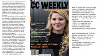
- 1. My magazine represents City College students by the way I used different codes. I used symbolic codes like colours in my magazine to represent what the students said they would find visually appealing and would like to see on a magazine. For example, in the results from my questionnaire, the students said they would like so see the colour black but also bright colours. I used both to appeal to my audience. The photo on the front cover is a symbolic and a technical code. I took the photo outside on campus so my target audience would relate to it because they would have seen the building before. I also chose that building to use at the background to incorporate both dark and bright colours which the students said they liked in my research. The student in the photo is looking right into the camera. Direct gaze draws the audience in because they feel like they are being personally addressed by the person in the photograph. The coverlines and contents are written codes. In them I used things from my research that students said they wanted to read about and are relevant to young people. Another written code I used was the language. I used the kind of language that college students would be used to reading and didn’t use words that would confuse them or lose their interest. The layout I used for both the front cover and the contents page is a technical code. I chose to lay out everything in a orderly way to look more visually appealing. If it were to have things look out of place it would look messy and wouldn’t appeal to the audience. What I’m pleased with on my front cover is my use of typefaces. I used sans serif because it looks smoother and more modern which would appeal to young people more. Another thing I’m pleased with is the colour scheme and how it fits with the main image and is very visually appealing. I’m also happy with the layout. The coverlines aren’t too close to the student’s face and the image is positioned in a place that wont disrupted by anything else on the cover. What I could improve is the size of the barcode, price and date. They’re too big and stand out too much so they could be made smaller to be less distracting. I could also use less exclamation marks because they are unnecessary and make the magazine look less professional .
- 2. What I am pleased with on my contents page is how I carried the colour scheme from the front colour onto the contents page because it made them match and look like they do indeed belong to the same magazine. Another thing I’m pleased with is the layout and how it is tidy and organised to look more appealing to the eye. It also matches the tidiness of the front cover which again reinforces the fact they belong to the same magazine. Things I could improve about this contents page is the spaces between some of the lines of the contents because some are further apart than others and it might make the page look less organised. I also could have used more images to allow the audience to relate more and want to look at the page more and continue reading the magazine.