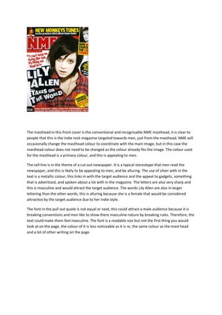
1. The masthead in this front cover is the conventional and recognisable NME masthead, it is clear to
people that this is the indie rock magazine targeted towards men, just from the masthead. NME will
occasionally change the masthead colour to coordinate with the main image, but in this case the
masthead colour does not need to be changed as the colour already fits the image. The colour used
for the masthead is a primary colour, and this is appealing to men.
The sell line is in the theme of a cut out newspaper. It is a typical stereotype that men read the
newspaper, and this is likely to be appealing to men, and be alluring. The use of silver with in the
text is a metallic colour, this links in with the target audience and the appeal to gadgets, something
that is advertised, and spoken about a lot with in the magazine. The letters are also very sharp and
this is masculine and would attract the target audience. The words Lily Allen are also in larger
lettering than the other words, this is alluring because she is a female that would be considered
attractive by the target audience due to her indie style.
The font in the pull out quote is not equal or neat, this could attract a male audience because it is
breaking conventions and men like to show there masculine nature by breaking rules. Therefore, the
text could make them feel masculine. The font is a readable size but not the first thing you would
look at on the page, the colour of it is less noticeable as it is re, the same colour as the mast head
and a lot of other writing on the page.