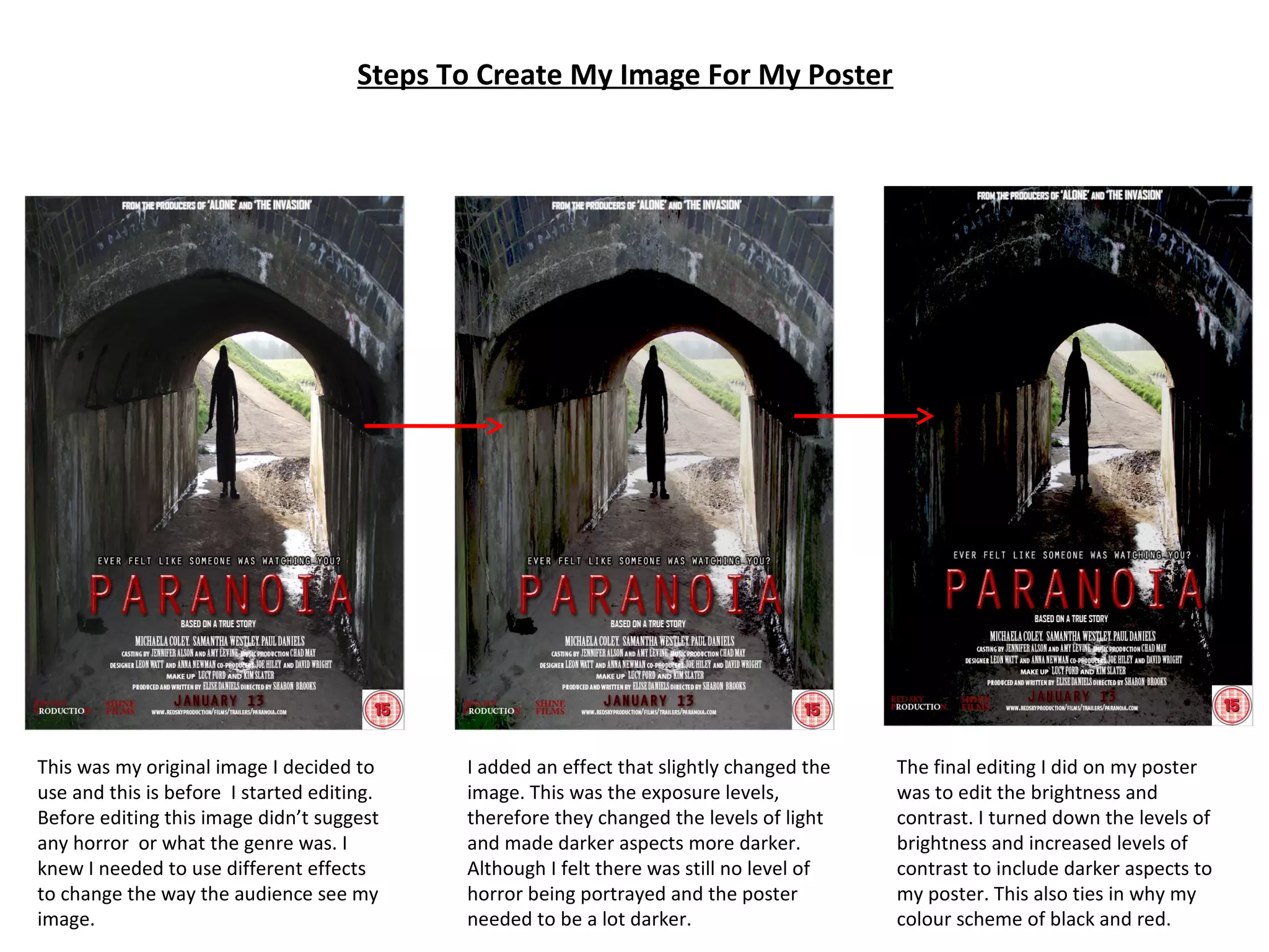
This document describes the steps taken to edit an original image for a horror movie poster. The image was initially plain and did not convey any genre. Exposure levels were adjusted to darken aspects of the image, but it still lacked horror. Finally, brightness was turned down and contrast increased, creating darker tones that suggested horror and tied into a black and red color scheme.