
Recommended
More Related Content
What's hot
Viewers also liked
Viewers also liked (20)
Similar to Q2 re
Similar to Q2 re (20)
More from elaboscabbo
More from elaboscabbo (20)
Recently uploaded
Recently uploaded (20)
Q2 re
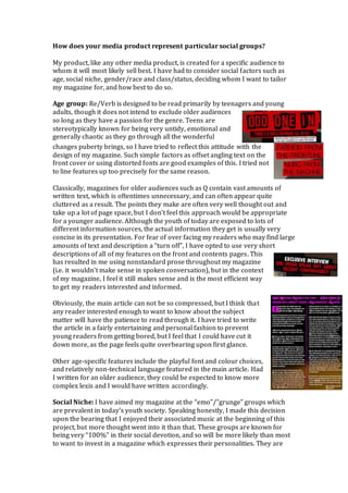
- 1. How does your media product represent particular social groups? My product, like any other media product, is created for a specific audience to whom it will most likely sell best. I have had to consider social factors such as age, social niche, gender/race and class/status, deciding whom I want to tailor my magazine for, and how best to do so. Age group: Re/Verb is designed to be read primarily by teenagers and young adults, though it does not intend to exclude older audiences so long as they have a passion for the genre. Teens are stereotypically known for being very untidy, emotional and generally chaotic as they go through all the wonderful changes puberty brings, so I have tried to reflect this attitude with the design of my magazine. Such simple factors as offset angling text on the front cover or using distorted fonts are good examples of this. I tried not to line features up too precisely for the same reason. Classically, magazines for older audiences such as Q contain vast amounts of written text, which is oftentimes unnecessary, and can often appear quite cluttered as a result. The points they make are often very well thought out and take up a lot of page space, but I don’t feel this approach would be appropriate for a younger audience. Although the youth of today are exposed to lots of different information sources, the actual information they get is usually very concise in its presentation. For fear of over facing my readers who may find large amounts of text and description a “turn off”, I have opted to use very short descriptions of all of my features on the front and contents pages. This has resulted in me using nonstandard prose throughout my magazine (i.e. it wouldn’t make sense in spoken conversation), but in the context of my magazine, I feel it still makes sense and is the most efficient way to get my readers interested and informed. Obviously, the main article can not be so compressed, but I think that any reader interested enough to want to know about the subject matter will have the patience to read through it. I have tried to write the article in a fairly entertaining and personal fashion to prevent young readers from getting bored, but I feel that I could have cut it down more, as the page feels quite overbearing upon first glance. Other age-specific features include the playful font and colour choices, and relatively non-technical language featured in the main article. Had I written for an older audience, they could be expected to know more complex lexis and I would have written accordingly. Social Niche: I have aimed my magazine at the “emo”/”grunge” groups which are prevalent in today’s youth society. Speaking honestly, I made this decision upon the bearing that I enjoyed their associated music at the beginning of this project, but more thought went into it than that. These groups are known for being very “100%” in their social devotion, and so will be more likely than most to want to invest in a magazine which expresses their personalities. They are
- 2. also heavily associated with music, so I thought who better to cater a music magazine to than a group who are almost guaranteed to unanimously love music. My product heavily represents the alt-rock scene in its jumbled, chaotic layout. The costumes of the artists and the attitudes they portray in the images relates to the way this audience tend to live their lives. My interviews told me that these people loved the genre as it allowed them to display their individuality, so I have tried to make the magazine stand out from standard convention. The artists expressions are the first things readers will look at when they see the front cover, so I have tried to relate to them by posing my artists with expressions reminiscent of the mournful expressions which characterise the social circles. Gender/Race: I did not want to exclude any gender or race from reading my publication, which is why I featured artists of both different genders and racial backgrounds on my front cover. It could be said that the red and black colour scheme is quite aggressive typically masculine, but I feel that female members of my target social group are rarely associated with being “girly girls”. Studies do show that men buy music magazines more commonly anyway, so it does not matter too much if a small number of women feel put off, but I would much prefer them not to, as gender equality is increasingly important in today’s society. Class/Status: The magazine is aimed at young, affluent people with high disposable income so the models I used are young, with expensive looking clothing. The magazine’s design seems slick and professional, catering to the higher-class aspects of my intended audience’s personas and its dark, dramatic style is reminiscent of their deep personal struggles, as are commonly associated with this audience (they’re often very overdramatic). That said, some of the fonts and styles I used appear slightly “dirty” or “worn”, which may appeal to lower class readers. This is incredibly presumptuous, but it was on my mind during production and I feel that although not terribly PC, there are many hard truths about business trends, especially in the magazine business as I discovered in my research.