Call Girls in Dwarka Mor Delhi Contact Us 9654467111
Q5 re
1. 5) How did you attract/address your audience?
My magazine is heavily stylised towards the alt-rock genre and features
young, emo-like stylings in order to best attract an appropriate, interested
audience to it. These features are listed as follows:
Presentation:
- Dark, high contast eyecatching colour scheme. Red and black are very
“dark” (literally and figuratively) colours, which my audience will like.
- Jumbled layout: this was the most popular selection in my audience
survey, and I feel that it conveys the general attitude that my audience
will resonate with. Teens are known for being unorganised, so I didn’t
think they would want to read a very precise and perfect looking
magazine.
- “Messy” fonts: all of the fonts I selected to use are either handwritten
or distorted in some fashion (where possible). This has resulted in an
overall text presentation which is worn, disorganised and very
‘authentic’ feeling. The target audience will hopefully appreciate this,
as I based this idea off the fact that ‘alt’ fashion usually includes very
worn-out looking clothes, and alt bands like to present their albums
and public presence in a similar manner.
Writing:
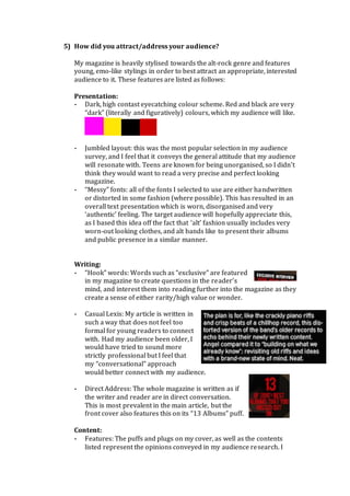
- “Hook” words: Words such as “exclusive” are featured
in my magazine to create questions in the reader’s
mind, and interest them into reading further into the magazine as they
create a sense of either rarity/high value or wonder.
- Casual Lexis: My article is written in
such a way that does not feel too
formal for young readers to connect
with. Had my audience been older, I
would have tried to sound more
strictly professional but I feel that
my “conversational” approach
would better connect with my audience.
- Direct Address: The whole magazine is written as if
the writer and reader are in direct conversation.
This is most prevalent in the main article, but the
front cover also features this on its “13 Albums” puff.
Content:
- Features: The puffs and plugs on my cover, as well as the contents
listed represent the opinions conveyed in my audience research. I
2. have featured interviews, reviews and competitions as they asked so I
hope this would interest them, were this magazine really produced.
- Genre loyalty: I tried to keep all of my
content focused on the particular
genres the magazine deals with, but I
was not afraid to expand it away from
music into fashion and celebrity as I
believe the high-income youths that
read this would be very interested.
I hope to attract the audience with its
striking, high contrast appearance and
fashionable feature artists. I hope the use
of distorted and chaotic fonts and layouts
will resonate with them, letting them
know that this publication is for
individuals like them. Even things such as
the featured band names and fantastical
nature of the “celebrity” aspect of the
article were intentional, as I believe that
these final decisions will appear desirable
in the eyes of my audience.
There is a certain aspect to visual design,
which cannot be explained. I hope that my
magazine matches the “feel” of my target audience. The attitude of the
entire magazine is one of community united against a common enemy/for
a common cause; to enjoy music.
Throughout my writing, photographs and
design work I have tried to emphasize
this sense of community and harsh
attitude but I cannot tell to what extent I
have succeeded. Only another pair of eyes
can tell me that.