
Recommended
More Related Content
What's hot
What's hot (16)
Viewers also liked
Viewers also liked (6)
Similar to Learning effective layout, models and colors for magazines
Similar to Learning effective layout, models and colors for magazines (20)
Recently uploaded
Recently uploaded (20)
Learning effective layout, models and colors for magazines
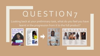
- 1. Q U E ST I O N 7 Looking back at your preliminary task, what do you feel you have learnt in the progression from it to the full product?
- 2. L O C AT I O N S H OT S I learnt that the location where I look my pictures made a big difference. For example, for the college magazine I just look my pictures in front of a white wall instead of finding a better location.While I was making my music magazine I thought about the locations that I was using to take my pictures. I made sure to use some locations that reflect the genre of my music magazine and made my pictures more interesting
- 3. T A K I N G P I CT U R E S I found more effective ways to take pictures. For example, for my college magazine some of my pictures some parts cut off because I the angles I took them.When I was taking pictures for my music magazine I took in consideration the ways in which I was taking my pictures. I made sure that I was not cutting out important parts of the image and the angles I was using.
- 4. C O L U M N S I found new ways of presenting a contents list using InDesign. In my college magazine I only used a one column structure which can be boring to look at and a lot to take in at once. In my music magazine I used four columns to show my contents list. I think that by doing it this way I was able to break down the list and make easier for the reader to find what they want to find. I learned that using more than one column made my contents page look more appealing to the audience I was trying to attract. My target audience is 18-30 and I know that younger people do not like to see a lot of writing and it could be off putting.This is why I broke my contents list down into columns so that I would be easier for them to take in.
- 5. M O D E L S I only used one model for my college magazine. I think that is wasn’t a good idea because It only shows the representation of one group of people when there are many type of people that go to college. As a result, I made sure I included a both genders so that I that I could show that my magazine is aimed at males and females.
- 6. C O L O U R S C H E M E S when making my college magazine I did not keep to a colour scheme. On the front cover, I used a bright blue colour for the text and on the contents the writing was in black. I did not think carefully about what colours complement my images because of this I was not able to establish a house style.When I started to make my music magazine, I made sure that all the text was in one colour throughout the front cover, contents and double page spread.
- 7. P A G E L AY O UT Through many trial and errors I learnt how to use the space on a page effectively.When I started making my college magazine, I was not aware of the different variations of columns I could have used to make better use of the page space. I just used one image on the contents page of my college magazine to fill in the space more.When I was making the contents page for my music magazine I focused on presenting my images in a way that uses the page space effectively and reflects my music genre.