Procuring digital preservation CAN be quick and painless with our new dynamic...
Reasearch into 3 genres of Magazine
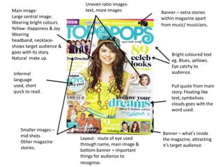
1. Uneven ratio images-
Main image- text, more images Banner – extra stories
Large central image. within magazine apart
Wearing bright colours from music/ musicians.
Yellow- Happiness & Joy
Wearing
headband, necklace-
shows target audience &
goes with its story. Bright coloured text
Natural make up. eg. Blues, yellows.
Eye catchy to
Informal audience.
language
used, short Pull quote from main
quick to read. story. Floating like
text, symbolises
clouds goes with the
word used.
Smaller images –
mid shots Banner – what's inside
Layout- route of eye used the magazine, attracting
Other magazine
through name, main image & it’s target audience
stories.
bottom banner = important
things for audience to
recognise.
2. Mast Head-
Large font – like diary Language- Informal
(girly font) Speaking to the audience
Bright (pink) using a similar language to
background- attractive it’s target audience Young
to audience, colour girls. Words used/ main
signifying the audience stories used eg. Boys &
is young girls shopping.
Font- ‘swirl’ font used
Images- associated with girls. Colour:
Top Image: cover shot with Pink
page references, showing the Highlighted text of main
audience the which pages stories makes them stand
the main stories are on. out to audience(more
-easy to understand, suitable appealing) .
for target audience.
Images of accessories- Image-
accompanying story – Fashion (Mid shot)
associated with tween/teen Boy band, attracting target
girls. audience of magazine
shows genre of magazine
Action shot image- eg. Music.
(Mid shot)
Showing what a certain Colours: Bright colours
celebrity does, shows an Blue- stands
aspect of the magazine eg. out, mescaline.
Music Red- stands out, strong.
3. Mast Head – Mis-en-scene-
Biggest font on front cover Background: Blank, grey
(Bold) shinny
Colour- Black : elegance, style.
Costume:
Letters filled in with colour – White, Silver light colours
Yellow: Joy, Happiness Simple, natural look. – main
Blue: Calm focus on eyes stands out from
light
Headlines down one side of
the page. Give the main Light:
attention of the magazine elegance, clear shown on the
cover on the central image. most important thing.
Fonts-
White: Headline –
Purity, simplicity, peace, eleg Large font attracting the
ant. audience attention shows
Yellow: Joy, happiness. that it is one of the main
Layout- route of eye: focuses of the magazine.
First : Masthead – first aspect of
what the audience will see on the One sentence description of
cover. article – Informal language
quick and easy to read
Second: Looks over central image. , short so that the audience
has to read the magazine to
End: Barcode, Date & price the last find out more.
thing so see as people would have
decided if they wanted to buy it
already by looking at the contents.
4. Images-
Charts- (Mid Shots)
Music Charts list Colours: Black &
shows genre of white clothing-
magazine (Music) smart, Rock:
Attracts the target dressed as
audience : teens+ modern artists.
font- Page references
Large, block showing main
continuous style. features of
Colour: magazine show
Black& White – target audience.
opposites, Strong
pure colours.
Language-
Colours- Informal:
Grey: Maturity Short sentenced
Blue: headings, quick, easy
Confidence, youth to read
Black: Makes the audience
Authority, Formal, eleg want to read
ant on, having to buy the
White: magazine.
Perfection, Purity, light
5. Banner- showing
Title- top of page in different bands within
route of eye first thing magazine (at route of
to see. eye)
Effect- smashed
glass, showing the
music genre of
magazine. Central image-
Red shirt- symbolises
danger, loud (rock)
Pose- swearing
associated with rock
Informal language – short music.
sentences for headings Costume: Basic t-shirt
quick to read. Colour: Red used with
Exclamation points used the font.
to show ‘Shouting’
Large text to gain
(loud, rock)
audiences attention.
Bold Font- symbolises
strong and bold
characteristics.
Plus: showing that there is
more to the magazine
than what has already Even ration of
been shown. images to text.
6. Images- Pull Quote-
Images are all relevant to Attracts the audience
the magazine. (Music) to read the magazine
(Mid Shot) – to get more to find this certain
people in shot & close quote.
enough to see their faces so
people can recognise them
(Close Up) Showing the main Ideology-
focus of that image eg. Artist Navigates the audience
(Mid Shot, Low angle) around the magazine
showing what stories
Large Image- /articles are on certain
Showing a main focus of the pages. By making the
magazine. Most likely to contents page interesting it
catch the audiences eye if it makes the audience keep
is bigger. reading.
Small Image- Layout-
Showing the other Images all together with the
stories/articles within the page references so the
rest of the magazine. audience know which pages
Language- to look.
Informal language Text down the side of the
constant from cover page showing page
page. Gives the article a references so the audience
basic look so that the knows where to read.
audience has to read on
to find out more. Everything is close together
Colours- Red: loud, danger strong . Yellow: happy, joyful and squeezed to fit in.
Black: mystery, negative.
7. Language-
Images- Informal & formal : Formal language during the interview
(Long Shot) text showing quotations of artist/bands. Informal language
Action shot used to attract people to the interview. Pull Quote-
Showing the genre From
of magazine (Music- interview, showing
Rock) Props in image what is expected in
eg. Microphone the interview. Makes
the audience want to
(Mid Shot) read the interview
Action shot from the pull quote
With guitar showing in doing so will read
genre of magazine. the whole of the
interview.
(Close Up)
Action shot singing
showing magazine
genre.
-Microphone &
Head phones.
-All images in black
and white, makes
the text stand out.
Colour- Font-
Layout- Black, Red & white : Continuous Large, bold font –
Large Image on one page & colours within magazine (Cover & scuffed(dirty/broken) effect
smaller image – spaced out. Contents page) , associated with ‘Rock’
On second page heading, text Red: genres.
and images all close together. Anger, danger, passion, anger. Colours: Red & White
Black: power, mysterious.
8. Masthead -
Fairly large, hidden
by central image, Central image-
showing it is a well complete main focus
known magazine for of this issue of
people not to see magazine covering
the name. title.
-continuous layout
for audience to Clothing- Blue and
recognise it. white match the
colours used in the
title and other text
Informal language- colour.
-Shorts and vest top
Large text of heading- support the time of
short explanation of when the magazine
article. was produced
-Barrier to split the (summer)
headings showing that -simple make
their different. up, classy trade mark
-Fonts all very similar to magazine (Women
on headings, same central image)
size.
-Title unique to
everything. Smaller text at bottom of
--Main article font route of eye- not main Un-even ration to images and text
bigger than other article but still important to More text than image (1 central
headings. image) continuous layout.
be on the front page.
9. Mast head-
In the beginning of the Above mast
route of eye. head, Headline –
Important story
Red- within the magazine.
Loud, Strong, intense
colour Headings and main
(associated with Rock) stories down one side
Borderline white and –
black shading Keeps them all
continuous within together gives main
magazine. focus of magazine on
the main image.
Mis-en-scene
Hair & Make-up-
Font-
Simple/ natural look
Bigger the font of the
pale colours (classy)
headline the more
interesting to
audience/ appealing.
Main headline –
Font to match the font Informal language
of artists album. used quick and easy to
Font colour: White read for audience.
colour –
Pure, Simplicity, youth.
10. Text on the side of the
page put together. Large image- the
Barriers between each man focus to get
article splits it up peoples attention.
making it separate. (Mid shot)
Short sentence Smaller one person
headlines. image well known
celebrity to attract
audience
(Mid Shot)
Red-
Colour represents loud
(rock).
Yellow on red Larger image –
background makes it An average shot not
stand out set up, close up. With
article.
Informal language Extras in the magazine,
used like on front not just stories eg. Poll’s
cover, continuous.
Easy and quick to
read
11. Colours- Mode of Address-
Red: Anger, Danger, Rage, Formal language used, shows the target Layout-
willpower. audience because of it, informal language All Images on second
Black : Power, elegancy, mystery. used on cover and contents page to build page
Negative connotation up for main interview. Full text on first page
White: light, safe, positive equal ratio of images
connotation to text. Text& images
Ordered on page, have
their own space on
page. Shows the
target audience of the
magazine to be 17+
because of the
organisation.
Images: Typography: Bold red font on
Long, Wide shot- Shows both the artist and the image shows it’s important. kicker shows it’s importance
Long shot – shows all of band in the shot and the scene of image shows it’s important. at the beginning of the article.
One page images merged into one, two different scenarios. Similar font style as kicker in
Place 1: Concert stage, Guitar & amp. beginning of the text &
Place2: Aeroplane, guitar & News paper with appropriate heading of image. smaller similar font in the
Black & white image- Classy, modern, shows the age of the target audience 16+ darker main of the text.
colours.
12. Language-
Masthead- Informal
Font: Quick, easy to read short
Bold, large – stands out sentences.
on page. Not showing the audience
Colour: White stands out the whole of the story
from background(Red) making them want to read
the rest of the magazine.
Layout-
Top of route of eye: Name of
magazine and speciality of Pull Quote-
magazine making them the first Showing what main focus
things to read, making the first artist/band has said to
attraction to the magazine. attract audience from
Middle: Goes through the what they have said to
central image being the main read the while of
purpose of the magazine to interview of their
attract audience with favourite artists.
(Artist/Band)
End- Name of the artist/Band in
the magazine & Barcode/Price.
Colours:
Fonts- White –
Headings: Continuous (bold- Purity, light, simplicity, Perfe
stands out, gains attention of ction.
audience) shows importance. Red:
Other- Confidence, Courage, Energ
Small, thin font - less y, determination, passion.
importance. Dark Blue: Show
perspective, Inspiration.
13. Images: Masthead-
(Long shots) Bold, block, large font.
Shows whole of artist in Beginning of ‘Route of eye’ Gives
action shot, the first impression of the page
Microphones & guitar – ‘This Week’ shows that the page is
shows the genre of the about the week. Black –
magazine main, continuous colour of
Guitars associated with magazine- bold noticeable colour.
‘Rock’. NME- title of the magazine
continuous from cover to contents
Clothing – leather jacket & page. Red- main, continuous
t-shirt (black) Skinny Jeans colour of magazine stands out.
(dark blue). – clothing White- main continuous colour of
associated with ‘Rock’ magazine, makes other two
Long sleeved shirt (white) colours stand out on page.
Jeans(dark blue)
Colours-
Red:
Layout- Anger, Danger, courage, de
More text compared to termination passionate –
images on page and uneven characteristics of music
ratio, not continuous of front genre ‘Rock’
cover. Ordered layout, easy to Black:
read & understand. Aggressive, prestigious, my
Text & images put tightly sterious.
together. Text surrounding White: opposite of
images. Typography- black, allows other colours
Continuous font used throughout the page, Bold easy to stand out.
to read text font: Black & white.
Bold- characteristic of ‘Rock’ genre music.
14. Layout-
Image- Less text to image ratio
Long shot More image- takes up most of the attention on
One large image takes over one page page.
of double spread. Large makes it the Text pushed to the side- Spaced out not cluttered.
centre of attention on the page
Colours:
Red, White, Black
Typography-
Large fonts:
different
(opposite) fonts
Serif Font & Sans
serif font, shows
both sided
magazine.
Smaller fonts: very
similar, continuous
Highlighted words
(blue) make the
artist name stand
out.
Kicker Serif Font
Colours- same as other
Red: Danger, Anger, courage, determination Serif font.
& passion Mode of address- Formal : Slang not used
White: Positivity, clear throughout interview text, full sentences. Shows that
Black: Negative, aggressive, prestigious & informal was used to attract audience to actual
mysterious. interview.