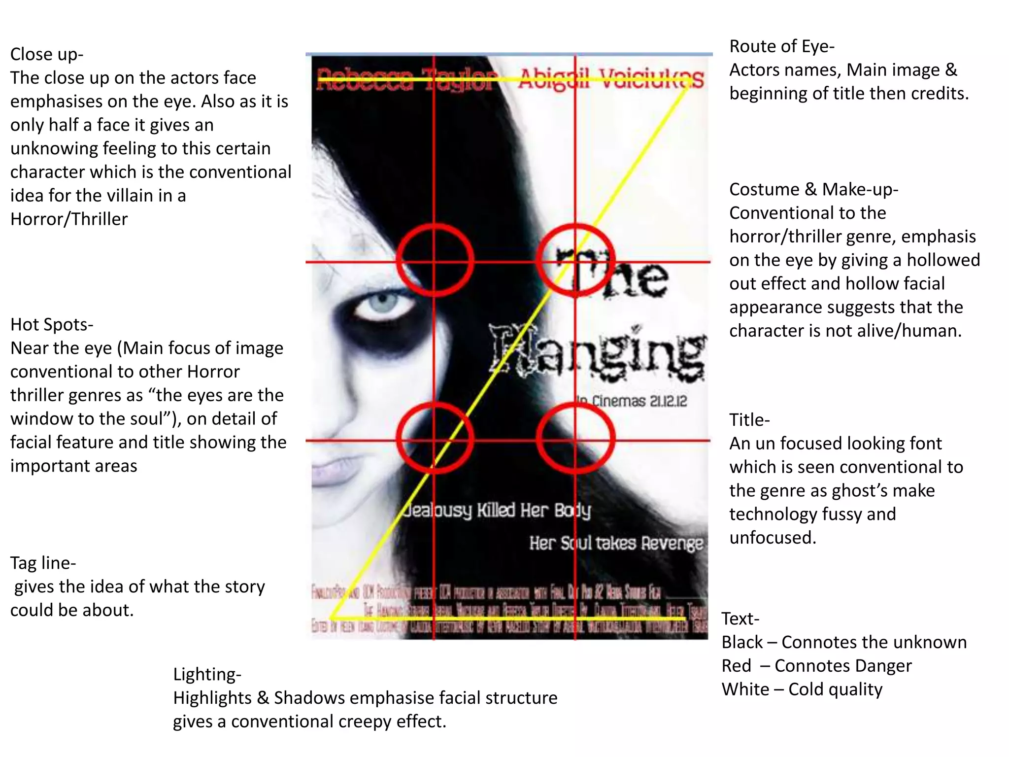
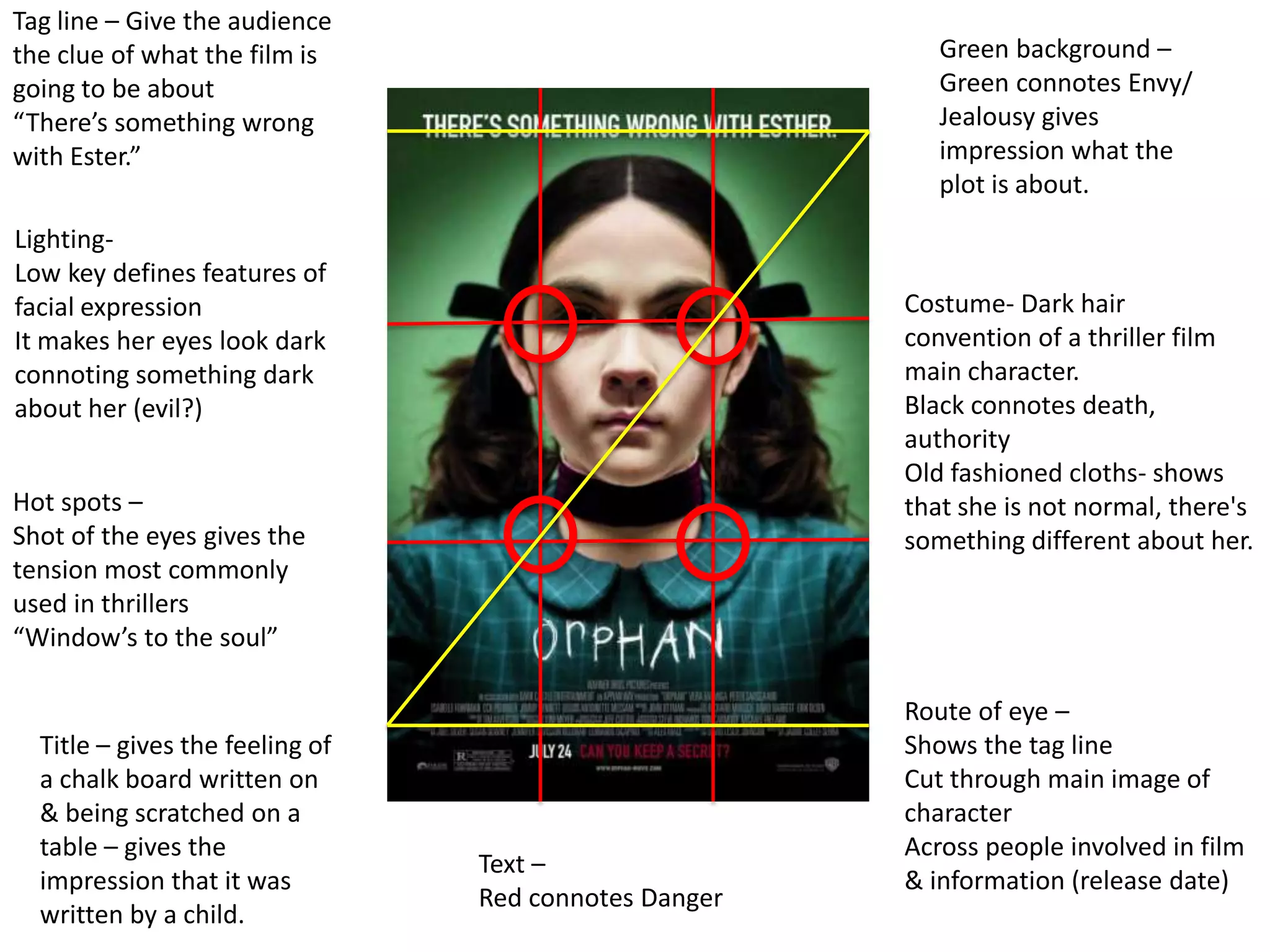
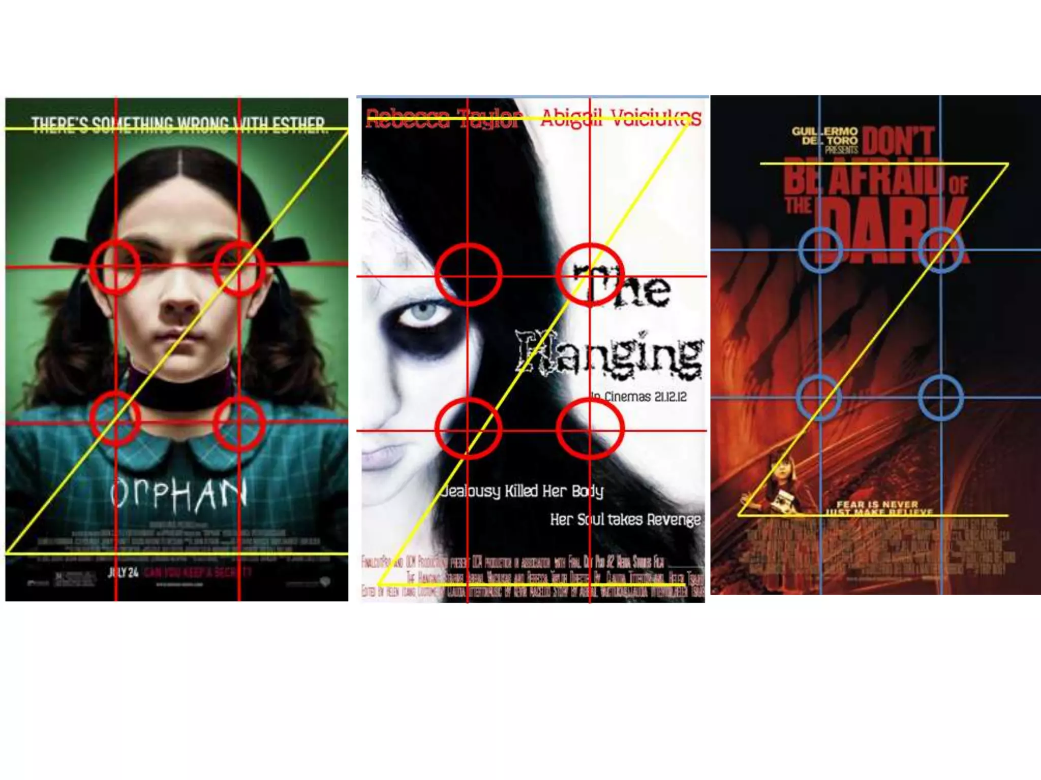
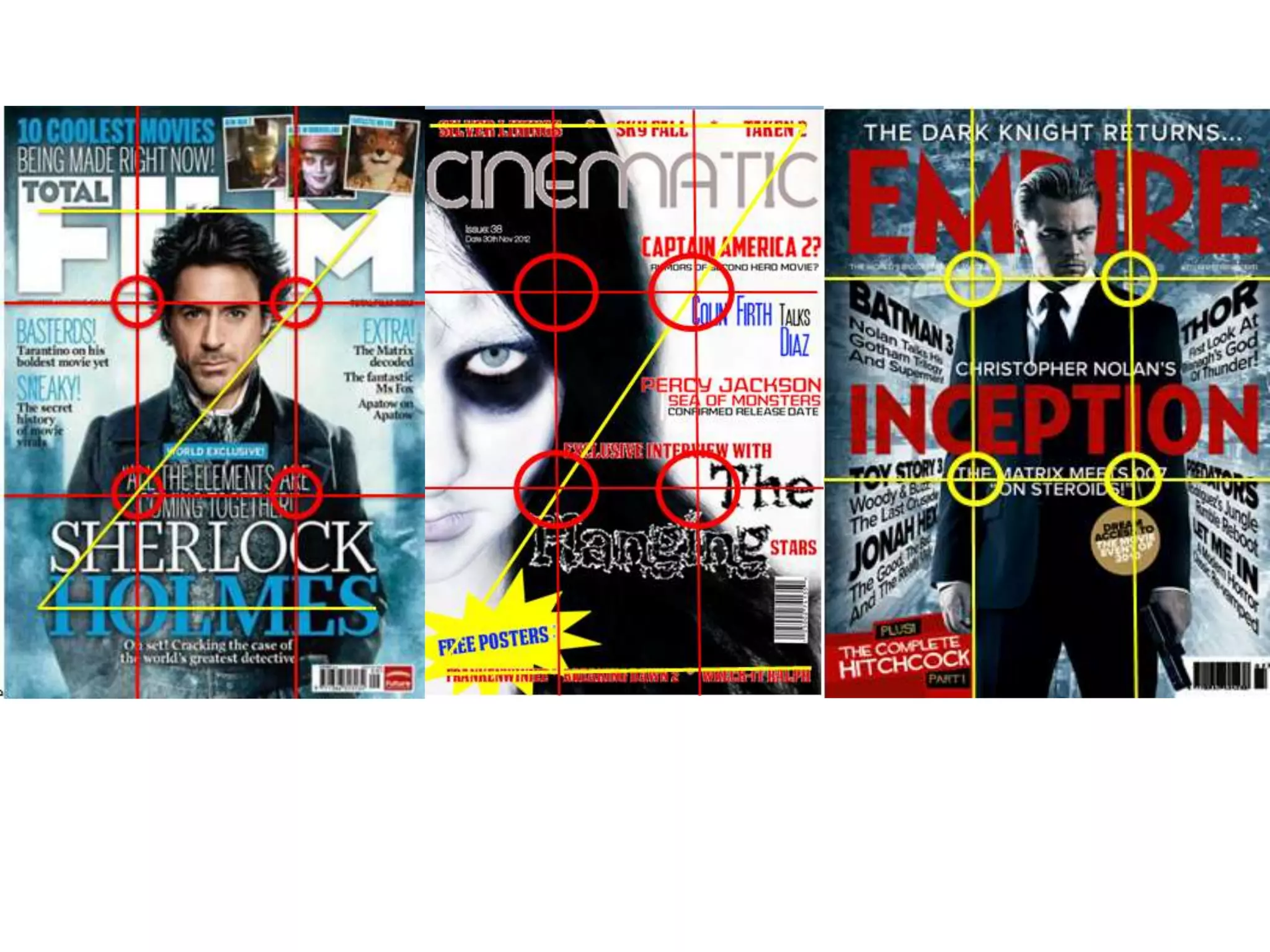
1. Close up- Route of Eye-
The close up on the actors face Actors names, Main image &
emphasises on the eye. Also as it is beginning of title then credits.
only half a face it gives an
unknowing feeling to this certain
character which is the conventional
idea for the villain in a Costume & Make-up-
Horror/Thriller Conventional to the
horror/thriller genre, emphasis
on the eye by giving a hollowed
out effect and hollow facial
appearance suggests that the
Hot Spots- character is not alive/human.
Near the eye (Main focus of image
conventional to other Horror
thriller genres as “the eyes are the
window to the soul”), on detail of Title-
facial feature and title showing the An un focused looking font
important areas which is seen conventional to
the genre as ghost’s make
technology fussy and
unfocused.
Tag line-
gives the idea of what the story
could be about. Text-
Black – Connotes the unknown
Lighting- Red – Connotes Danger
Highlights & Shadows emphasise facial structure White – Cold quality
gives a conventional creepy effect.
2. Tag line – Give the audience
the clue of what the film is Green background –
going to be about Green connotes Envy/
“There’s something wrong Jealousy gives
with Ester.” impression what the
plot is about.
Lighting-
Low key defines features of
facial expression Costume- Dark hair
It makes her eyes look dark convention of a thriller film
connoting something dark main character.
about her (evil?) Black connotes death,
authority
Old fashioned cloths- shows
Hot spots – that she is not normal, there's
Shot of the eyes gives the something different about her.
tension most commonly
used in thrillers
“Window’s to the soul”
Route of eye –
Title – gives the feeling of Shows the tag line
a chalk board written on Cut through main image of
& being scratched on a character
table – gives the Across people involved in film
Text –
impression that it was & information (release date)
Red connotes Danger
written by a child.
3.
4. Route of eye-
Title-
Through names of other films
Different colour makes mentioned with the magazine
it stand out. so people know what else is in
that issue, through central
image & finishing with Free
Hot Spots- posters to catch the audiences
The Central image is within 3 eye as it is also the last thing
of four hot spots emphasises they see.
the appearance of the person
showing the facial structure,
also showing it’s importance.
The other articles are also
within the spots to also grab Central image-
audiences’ attention. The same as the poster of
the film showing the link
and connection between
both.
Cover lines – Different
fonts to make them
different and unique to
each other. Background-
Plain white, brings
emphasis to the central
Main cover line- image & text
Largest font on the
cover, makes it stand
out to audience
5. Title – Banner –
Large and bold brings Inside posters to intrigue
the attention of the the audience for free
audience, helps to things.
remember the name. Information which is
unknown to public gets
Hot Spot- audiences attention.
Facial focus, shows
importance of facial
expression and eyes, most Cover lines-
common with thrillers. The same fonts and
Tag line- indication of film, sizes, shows that they
may be used to intrigue the are not the highlighted
audience and give an titles.
essence of the film/ plot. Exclamation point to
attract more attention.
Route of eye-
Main- larger font, gains
Title of the magazine to draw
more attention from
attention of audience if they
target audience, shows
know of magazine, .through
it’s the main
central image the actor gains
story/topic of this
attention of audience who
issue.
know of them & their films
finally the name of the film
title which will also attract the
attention of people who like/
know of Sherlock Holmes