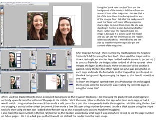
1. Using the ‘quick selection tool’ I cut out the
background of the model. I did this as from my
research from other magazines I can see that a
lot of the time there is no background for any
of the images. One I did all of the background I
used the ‘lasso tool’ to cut off any uneven or
sharp edges to make it look more like she was
standing in front of a plain background rather
than I cut her out. The reason I chose this
image is because it is a close up of the model
and you can see her whole face so the readers
will know who she is. I moved her to the left
side so that there is more space to put the
content of the magazine.
After I had cut her out I then inserted my masthead and the headline
‘contents’ I did this using the ‘text tool’ I then used the shape tool to
draw a rectangle, on another layer I added a white square to put on top (
to use as a frame for the images) after I added all of the squares I then
merged the layers so that I could move this section to the position I
wanted. Using the text tool I then typed out what was going to be on
each page and made the font white so that it would be easy to read on
the dark background. Again merging the layers so that I could move it as
one layer.
To insert the images I opened them on a Photoshop file and dragged
them across onto the document I was creating my contents page on
using the ‘move tool’
After I used the gradient tool to make a coloured background so that it wasn’t too bland. I did this using the gradient tool and dragging it
vertically upwards from the bottom of the page in the middle. I did it the same colour as the box that says what is on each page so that it
would match. Using another document I then made a side poster for a quiz that is supposedly inside the magazine, I did this using the text tool
and dragging it across to the correct document. I then made a fake CD cover using another document. I made a black square using the shape
tool and then using the text tool I added white font on top so that it would stand out and match my magazine.
I also made the page number in the top right corner so that readers would know what page it was and where to look to see the page number
on future pages. I did it in a dark grey so that it would not distract the reader from the main image.
2. Feed back – Nicole Manley:
You have done a nice job of cutting out your
model however your masthead is hidden in parts
of her hair. Also the background doesn’t look like
she is standing in front of a white screen it looks
like you have pasted her onto it. Finally the colour
of your masthead and headline do not match the
rest of the page, i.e. the blue box and the
background.