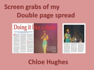
2. Firstly I imported my chosen picture onto one side of my double page
spread. I chose to let my image ‘bleed; onto the other side just a
little bit, as magazine like Q do this.
3. I then added my heading, making at as big as possible in order for it to
stand out to the audience. I chose to do it red in order to match my
‘Great Britain’ theme, also so it stands out.
4. Then I added a quote from my article on one side of my double
page spread. I decided to have my font white so it stands out
from the background but also because it matches my theme of
British.
5. I then imported the text, of which I had previously written on a
word document. I imported it so it was in 3 columns and added
drop capitals to break up my text so its more pleasing to the
eye.
6. I then added my stand first which was actually part of my article that i
took out, I decided to use blue as it matches the British flag which is
my theme.
7. The last thing I had to add to my double page spread was the page number
and issue date which I added to the bottom left of the spread.
8. As all my text did not fit on one page i had to have a 3rd
page. Therefore the first thing I done was import another
picture.
9. I then added the remaining text that was left over and levelled it off
so that it was all in one block. I didn't add another drop capital as
the image breaks compliments the text so it doesn't look too much
10. Finally, I added the page number and the issue number to
the bottom left of the page.
11. This is my final production of my double page spread which is actually
3 pages. As you can see the theme of ‘British’ is the same throughout.