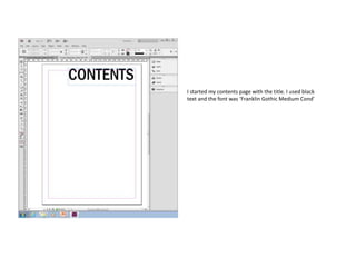
1. I started my contents page with the title. I used black
text and the font was ‘Franklin Gothic Medium Cond’
2. I then added a text box and made three
columns to follow the rule of thirds. I have
organised the features under subject headings
to make it easier for the audience to find what
they are looking for.
3. I added this image after editing it in Photoshop. I
placed it in the top left hand corner however I had to
add a white stroke on my title so that it stood out
from the picture.
4. I decided to change the three columns to four
after looking at my original drafts. This is
because I wanted pictures going down the right
hand side as well as being able to fit a editors
message .
5. After that I added another text box for
my editors message. The text is also a
size 12 as I wanted the page to be full
of information.
6. I added the three images and made sure they
were all the same size so that it looked
professional. I left a space underneath each
image so that I could add an anchor to explain
what the image was.
7. I then finished filling in the blank space with
more features so that the audience know what
page you can find certain articles. I also
included the facebook page and twitter page.
8. To fill in the blank space at the top I added a
small image of the front cover of my magazine.
This completed my contents page as all the
blank space was filled and looked professional.