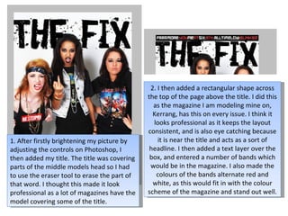
1. 2. I then added a rectangular shape across the top of the page above the title. I did this as the magazine I am modeling mine on, Kerrang, has this on every issue. I think it looks professional as it keeps the layout consistent, and is also eye catching because it is near the title and acts as a sort of headline. I then added a text layer over the box, and entered a number of bands which would be in the magazine. I also made the colours of the bands alternate red and white, as this would fit in with the colour scheme of the magazine and stand out well. 1. After firstly brightening my picture by adjusting the controls on Photoshop, I then added my title. The title was covering parts of the middle models head so I had to use the eraser tool to erase the part of that word. I thought this made it look professional as a lot of magazines have the model covering some of the title.
2. 3. I next had to think of a name for my band. I wanted to think of something that was quite rebellious, and gave the impression that the girls didn’t care what people thought of them. I came up with Just Plain Jealous, and immediately thought it suited the style of the band. I then went onto dafont.com to find a suitable font to use for the band name on the cover. I found the font ‘Phorssa’ and thought it added well to the attitude of the band is looks like newspaper cut outs.
3. 4. I then added more information about the band and a strap line to grab the readers attention. I continued with the red, black and white theme as I thought consistent colours would make the cover look more professional and the red and black are quite rocky colours. 5. I also added a picture from the YouMeAtSix concert I recently went too advertising exclusive pictures. I thought this added to the cover well as I took the picture myself so it looked professional.
4. 6. I then also added a picture of Hayley Williams that I recently took at a Paramore concert and advertised posters. I added shadows and adjusted the depth of the picture to make it look like it had depth and there were more than one poster inside. I felt this added to the professional look as magazines get most of their money due to advertising.
5. 7. For finishing touches I added a barcode, the date, issue number, and price of the magazine to give it a finished, professional look.