1. BOTH IMAGES WILL BE ENCHANCE IN THE FIRST AND FINAL DRAFT
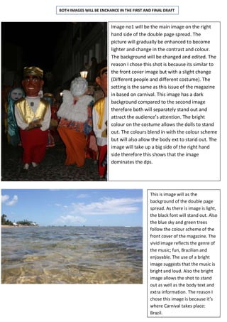
Image no1 will be the main image on the right
hand side of the double page spread. The
picture will gradually be enhanced to become
lighter and change in the contrast and colour.
The background will be changed and edited. The
reason I chose this shot is because its similar to
the front cover image but with a slight change
(Different people and different costume). The
setting is the same as this issue of the magazine
in based on carnival. This image has a dark
background compared to the second image
therefore both will separately stand out and
attract the audience’s attention. The bright
colour on the costume allows the dolls to stand
out. The colours blend in with the colour scheme
but will also allow the body ext to stand out. The
image will take up a big side of the right hand
side therefore this shows that the image
dominates the dps.
This is image will as the
background of the double page
spread. As there is image is light,
the black font will stand out. Also
the blue sky and green trees
follow the colour scheme of the
front cover of the magazine. The
vivid image reflects the genre of
the music; fun, Brazilian and
enjoyable. The use of a bright
image suggests that the music is
bright and loud. Also the bright
image allows the shot to stand
out as well as the body text and
extra information. The reason I
chose this image is because it’s
where Carnival takes place:
Brazil.