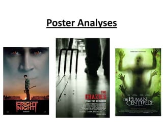
2. Colour:
The colour scheme used is very dull and stereotypical colours used for a horror
poster. The use of the dark reds and blacks and greys shows the anger and
mystery behind it. The red eyes are very powerful with the black outline making
them stand out more. If you look at them long enough it gets to the point where
you feeling they are looking right into you to scare you. Main image:
The main image is simplistic but
Title: still very powerful. It doesn’t give
The title is very bold, and does away who comes out on top and
catch the eye with the style and who doesn’t, even though you can
colours they have used. The colour see who is the victim and who is
scheme of the font is white and the bad guy. The bad guy is clearly
outline and to me this is because the one with the red eyes and the
the font is in the shape and style of red eyes portray anger and hatred
a pair of vampire fangs, With the and you just can’t see past them.
longer letters on the end The way they have him higher in
representing the fangs. This links the photo portrays power and
with the colour because the white shows he has the higher ground,
shows white teeth then the red however he’s fading away from the
represents the blood as if to bottom up which shows he’s
symbolise that they have been disappearing or being defeated.
used. The fact that the other character
on the picture is clear and standing
straight holding an axe also shows
Tagline: he has power which contradicts
The tagline used is ‘you can’t run from evil when it lives next door’ this Is each other. Also the sun at the
a message to scare whoever is reading it, it’s saying to me can you really bottom rising means the vampire
trust your neighbours or those close to you. To make you think is can’t be out as they are harmed by
everyone safe or what's going on behind close doors and this film gives sunlight and it gives the impression
you one idea that could be happening. the sun is on the other guys side.
3. Tagline:
‘Their flesh is his fantasy’ this shows that there is one main guy and he
clearly is a psychopath or a mentally wrong person in some way as flesh is
human skin and it being your fantasy doesn’t sound positive and linking it
with the main image doesn’t sound like a good fantasy
Title:
Main Image: The font used in the title
The main image used is very isn’t that bold and
graphical and can be looked doesn’t really stand out
at as quite disturbing if you that much, however it
have seen the trailer has a more old and
because by seeing the twisted element to it
trailer or knowing what the which connotes that the
film is about you know why film could have a weird
the hands are placed where twisted element to it, like
they are. You can also make a psychopathic meaning
out that it’s a person behind behind the title. The font
some type of window and colour used is very bland
the facial expressions you ad basic they haven’t
can see don’t look very really adventured with
happy then look like an the title more just left it
expression of pain. The plain white which lacks
blood smears down the boldness behind it.
window also give an Colours:
element of gore behind it to The colours are very dull and bland colours which doesn’t give off any
show the audience there happy emotions, the colour scheme just gives off a dull depressing
will be scenes of gore. feeling inside and comes across like a very dark film due the colours
being dark with no emotion within them
4. Colour:
The colour scheme is very grey and dark which gives the sense of darkness and evil amongst the
film, and also shows no light colours on the poster at all which takes away any positive emotions
towards the film so the audience know straight away this film isn’t going to be a happy story
Main Image:
This main image is the boldest out
Title:
of the three in my opinion because
‘The crazies’ straight away
it’s got one of the scariest images
gives off the impression
and puts a horrible image in your
the film is going to be
head, first of all the setting is in
about something not
some sort of long corridor school
normal and negatively
or hospital corridor by the looks of
crazy to the norms of
it. So standing in an empty corridor
society. The colour is a
is still spooky on its own but to
bold red like the fright
then have what looks to be a man
night title, again connotes
dragging a pitch fork with a trail of
blood, anger, hatred, evil.
blood coming from it would be
The style of the font is
very scary. The blood gives the
each letter is split up which
image that he has killed someone
could mean anything up to
or something. Also the noise it
me it represents the mind
would make by being dragged is a
splitting and going crazy.
very scratchy loud painful noise,
almost like screams. Tagline:
‘Fear thy neighbour’ this statement contradicts one of the ten
commandments ‘love thy neighbour’ which could be saying is there a
god? Because why would things like this happen if there was