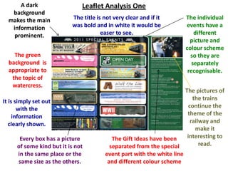
1. A dark Leaflet Analysis One
background
makes the main The title is not very clear and if it The individual
information was bold and in white it would be events have a
prominent. easer to see. different
picture and
colour scheme
The green so they are
background is separately
appropriate to recognisable.
the topic of
watercress.
The pictures of
It is simply set out the trains
with the continue the
information theme of the
clearly shown. railway and
make it
Every box has a picture The Gift Ideas have been interesting to
of some kind but it is not separated from the special read.
in the same place or the event part with the white line
same size as the others. and different colour scheme
2. Leaflet Analysis One
The companies logo,
Brooklands, is clear It has a light
to see in the to background with dark
corner. lettering that is another
affective way for the
text to stand out.
The flags give the flyer
a sense of party and
fun. It is all cartoon pictures
rather than
It is simply set out with photographs.
the information clearly
shown. The title is clear to see
and is in big, bold
The discount offer it capitals to be clearly
clear to see on the seen.
parcels label. This
interests the observer. The images of the planes
and the woman's cloths
Clear contact information at the reinforces the 1940’s
bottom of the page for people to find theme.
out more.