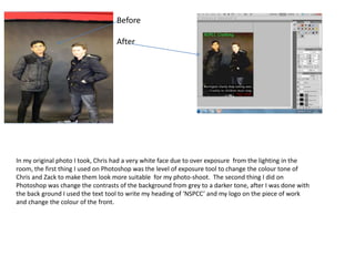
1. In my original photo I took, Chris had a very white face due to over exposure from the lighting in the
room, the first thing I used on Photoshop was the level of exposure tool to change the colour tone of
Chris and Zack to make them look more suitable for my photo-shoot. The second thing I did on
Photoshop was change the contrasts of the background from grey to a darker tone, after I was done with
the back ground I used the text tool to write my heading of ‘NSPCC’ and my logo on the piece of work
and change the colour of the front.
Before
After
2. • On my second Image I changed the exposure of the cover to give a darker background and lighter facial
features. As you can see I used the exposure tool on the back ground layer, so only the background layer
was effected by this tool. The second thing I did was change the saturation of the picture to give a hint of
blue and change the tone of the picture to give a more serious look with the text looking more bold.
Before any
editing Exposure Saturation
3. • On my third image I changed the filter to a noir setting to show a serious tone and to look like an old
fashioned poster. Afterwards I changed the facial features of Chris by removing some freckles and adding a
darker shadow to his face to highlight his chin and nose to make them more outstanding. Finally I added
the NSPCC logo in a green text and the tagline but used a black text box with white text in order to make
the text standout, also I changed the front on ‘FULL STOP.’ to red in order make the message clear.