
Recommended
More Related Content
What's hot
What's hot (20)
Viewers also liked
Viewers also liked (20)
Similar to Mixed Magazine cover analysis
Similar to Mixed Magazine cover analysis (20)
More from carlaharrisss
Recently uploaded
Recently uploaded (20)
Mixed Magazine cover analysis
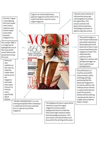
- 1. I like the colourscheme as I believethe coloursgo nicelytogethertoconvey the right effect. The coloursusedare red, black,white andbrown. The backgroundcolouris lightto make the central image standout. The title ’Vogue’ isoverlapping the front model and isred to standout and letthe reader knowwhat brand of magazine itis. There are also subtitleson the cover to showthe readerwhat storiesare in the magazine and make themwant to buyit to findout more, specifically about fashion. Vogue is an extremelyfamous, popularmagazine sothe title isinits classicfontthat isusedon every vogue magazine. The central image is a well-knownfashionicon and model calledCara Delevingne whichwill draw fansof Cara inand proveshowfamousthe magazine isitself. This showsthat the audience of the magazine iswomenand perhapsteenagersas Cara is well known amongstthem. The outfitCara is in revolvesaroundthe coloursbrown,white and beige perhaps portrayingthatthis particularmagazine is an autumnedition. Her makeupcolourscheme isnudesand brownsto match the autumn theme andherclothing. I wouldsaythe shot isa middle shotashalf her bodyis shown.‘THE BIG FASHION ISSUE’isin red writingandcapital lettersshowingit isimportantto the coverand that thisisa special issue of the magazine. The backgroundcolouris greywhich I believeisatrait forvogue magazinestohave a plain backgroundcolourto make the titlesandimage standoutrather than the backgroundcolour.This alsomeansa varietyof colourscan be usedfor the writingonthe cover. The number‘460’ is ina large textto highlightthe size of thisissue andto entice fashionand beautyfansto buy thisissue
- 2. BBC logoin the cornerof magazine so readerknowswhohasproduces the magazine. The cover title ‘GoodFood’isin white brightlystandingoutfromthe blue background.‘Good’and‘Food’ are alsoverysimilarwordsinthe waythat they’re speltsogowell together. The main coloursused throughoutthe coverare white,blue,yellowand red.All these coloursare summerycolours matchingwhenthe magazine wasissued- in June markingthe beginningof summer. The central image is of a towering strawberryandcream cake.This picture matchesthe summer theme with strawberries presentedthrough and on topof the cake.The central image shoulddraw foodlovers inand alsopeople who wouldlike tolearn the recipe. The back ground colour beingblue couldpresent the sky insummer.The pale blue theme also forcesthe central image to standout more as it contrastsagainstthe blue. The colour yellowisalsoaconnotationof summerwithyellow beingthe colourof the sun.Yellowisalsoa brightcolour makingthe smallerheadlinesstandout and showthe readerwhatis included withinthe magazine andhopefullymake themcuriousto buyand readon. The wordchoice ‘new’presentscuriositythe readerespeciallyif youare a subscriberto the magazine youwill wanttofindout what’snew. The word ‘Plus’isinbrightyellow, capital lettersandalsoa boldeffect highlightingitonthe page.The word‘plus’presentsthe ideathat the magazine isfull of recipesand informationmakingthe magazine soundmore exciting/appealingto the reader.It almostgivesthe idea that there are bonusestobuying thismagazine. Page numbershelp the readerin that theycan go straight to the page that intereststhemthe most.
- 3. Here we can see two younggirlsappearingtobe smileyandhappywhich couldportray the ideaof a familybuyinganewcosy home.One of the girlsis whisperingtothe other linkingtoone of the smallerheadlines‘design secrets’aswhispering alludestosecrets. Theyare bothwearingcrowns perhapsportrayingthat thishouse islike apalace, the perfecthome. A monochrome floorhasbeenused to make the house and frontcover appealingandwell established.The blackand white effectgivesaclassy feel tothe home and the blackand white contrastof one another makingthe coverstand out. The mastheadisin quite a brightpinkcolour whichcontrastswith the white/greyish background.I believe thispinkgoesnicely withthe colourscheme of black,white and brownaddinga nice colourto the cover.I wouldlike tointerpret the ideaof dull,dark backgroundcolours witha brightmasthead intomy magazine cover. Here a puff hasbeenusedto emphasise onwhyareadershould buythismagazine.Theyare claiming to choose the ‘bestnew products.’ The adjectivesof ‘best’and’new’ draw the readerinand reinforces thismagazine asbeingthe best home magazine.Italicshave also beenusedtogive the cover differenttypography. The magazine haspurposefullyused woodenfurniture onthe coverasit lookssophisticatedandgoeswith the monochrome theme.There are alsootherpiecesof wooden furniture inthe roomshowingthat the room has beenwell chosen/organised. Plugshave been useddownthe side of the coverand a text-wrapstyle has beenusedas differentlinesare longerthanothersto go withthe modern woodenstatue inthe corner.The word ‘secrets’hasbeen usedto cause curiosityinthe reader.The plugof ‘Home of the Month’ will drawloversof homesin.The typographyof ‘exclusive’isitalics witha colonshowing thissubtitle tobe significant.Giorgio Armani isof course a veryfamousfashion designerdrawing differenttypesof readersin. The white backgroundadds lightnesstothe roomand cover. The large windowcausesthiseffect also.I believeeditingmayhave beenusedonthe windowtogive the allusion of sunlightcoming throughthe window.
- 4. Here a bannerhasbeenusedalong witha list/tripletoinformthe readerof a summaryof what isin the magazine.The backgroundof thisisa turquoise colourmatching the blue theme. Here a plughasbeenusedalong withbulletpointstogive the reader extrainformationof whatisinthe magazine. Here alliterationhas beenusedof ‘tabby tubby’givesacomedic feel anddrawslovers of cats in.The magazine isalso showingthatitcan helpwiththe healthof animals. The use of a rhetorical questionis somethingIwould interpretintomy magazine. The main image onthe coveris of a very cute happy –lookingdog.The dog iswhite standingout fromthe blue background. The tongue of the dog is verypinkagainstanding out fromthe whitenessof the dog and the blue background.The tongue is too pinkmakingitappear that ithas beeneditedto make the cover standout more. The masthead isdark blue againstanding out fromthe lighterblue background.It isunderlinedin white to reinforce itas the masthead. The ideaof ‘bestfriends’ linkstothe ideaof dog beinga man’s bestfriend. All the plugsare in boldtypography so the readercan clearlyreadthem and be informedof what’s inside. Here a triple hasbeenused.Itis alsoa punon the well-known phrase ‘LightsCameraAction’togo withthe dog theme.