
Recommended
More Related Content
What's hot
What's hot (18)
Viewers also liked
Viewers also liked (15)
Similar to Teen Magazine Cover Design Conventions
Similar to Teen Magazine Cover Design Conventions (20)
More from nieevequinn
Recently uploaded
Recently uploaded (20)
Teen Magazine Cover Design Conventions
- 2. Type:GeneralMagazine(teenVOGUE) TargetAudience:Teenagegirls.14- 19 yearolds. Thesetypeof magazinesare targetedat teenagegirls.The keyimage of eachcover would appealto thetarget audienceastheymay lookupto the celebritythatis featuredonthefront of the magazine.Thesamecoloursareusedineachmagazinewhich arepinks, purplesand otherlight colours, thisisbecausethesearestereotypicallyusedto attract femaleaudiences. Each masthead(title)oneach frontcover hasthe sametypeof font which is boldand sometimesitalicwith thesame‘girly’colourse.g. pink, orange.Thisis alsoprovenwith the magazine‘TeenVogue’ theword ‘Teen’is in a bold,bubblyfontwhereasthe word ‘Vogue’ isin itsnormal sophisticatedfont – thiscatchestheeyemaking the audiencenotice it more. These arealsodesignedto attractthe right groupof peopleby having thecorrect contentinvolved, forinstancethismagazinewould haveinformationaboutfashion,make-up,somegossip aboutcelebrity’setc.Thesemagazinesaregeneralmagazinesasit covers a rangeof different topicse.g. itsnot alljust aboutfashion.Thelayoutof thisfront cover isboldandbright to attractyoungerfemalesthen olderonesasthereare childlikecolourswhereasolderfemales wouldhave sophisticatedcolourse.g. greys, blacks. Teen Magazines
- 3. ChildrenMagazines Type:SpecialistMagazine(Children’sTelevision) TargetAudience:4 – 9 yearolds.Girl andBoy. Thecontentof children’smagazinesis aboutcharactersof a TV programme targetedat very youngchildren.Thatwouldmake thesemagazinesa specialistmagazineastheyareall about onetopic e.g. ‘Tweenies’magazinewill involveinformationaboutthat TV programme and nothingelse.Thiswouldthenattractthe correct audienceandmake the magazinea lot more popularfrom looking a themain image. To appealto theright agegroupthesemagazines involve differentcoloursto attractto the right genderof the age groupe.g. pinkandpurpleis usedonprincessmagazinesmaking it appealto girls, blueandred isusedonsuperhero magazinesmaking it appealto boysaschildrenareattractedto stereotypicalcolourse.g. pink, blue. Thedifferenttypesof magazineswouldalsohelpattractdifferentgendersaseach mastheadwouldrepresenta differentTV programme so for example‘FiFi’would appealmore to a youngfemaleaudienceand‘Avengers’wouldappealmore to youngmale audiences,this is because‘FiFi’is targetedat young girls and‘Avengers’istargetedat young boys.Some childrenmagazinesare unisexwhich aretargetedandappealto bothgirls andboyse.g. ‘Cbeebies’.Forthosemagazinestheyhave useddifferentcoloursto attractto bothgenderse.g. green andyellow.Thisisso themagazinedoesn’tlookto ‘girly’or‘boyish’.
- 4. Music Magazines Type:SpecialistMagazine(Music) TargetAudience:MenandWomen.20+likes music. Thistypeof magazinewould appealto it’stargetaudienceasthe fontsusedare very basicwhich wouldsuitan olderaudience.Themastheadis big and boldandin most casesthe key image iscovering most of the mastheadasthisisa well known music magazine.Theanchoragetext is placedjustabovethe key image in a big sizefont. Havingthe anchoragetext big would attractmore people,thisisbecausetheywouldbe ableto readthe text from a distanceawayand beintriguedaboutwhat elseis featured inthe magazineandwouldalsorecognisethekey image. Thecoloursusedare very basictoo e.g. red, black,white. Havingit thisway will appealto the olderaudienceand to bothmen andwomen asthe coloursare notstereotypicale.g. pink, blue.Thekey image onthismagazineis a femaleto attract thefemaleaudience,mostof these magazinesnormallyinvolve malesastheirkey image, thiscouldconfusewhat gender the targetedaudienceis.Inthiscasea well known femaleartisthasbeenused,thisisto attractthe right groupof peoplewho areinterestedinmusic. Selllinesare placedon eithersideof the key image sonot to cover herface, theseareall in thesamefont but slightlysmallerthenthe anchoragetext. The selllinesareusedso theaudiencecan see what isfeaturedinthisissueandknow whetheritsworth buyingor not.
- 5. AsElleisa higherendmagazine theyconsistofhaving wellknowncelebrity’sas theirmainimage alsoas the magazineis populartheyhavethemainimagecoverthe mastheadas theaudiencealreadyknowsthemagazine.In thisissuetheyhaveusedMileyCyrus,thisisbecauseshe isa rolemodelformanyfemalessothiswaytheyare appealingtothetargetaudience.Manydifferentmodels, actressesandmusicartistsareusedforElle’smainimage as thentheywillattractevenmorepeopleas not everybodyintheaudiencelikesthesamecelebrity– it alsodependswhetherthecelebrityhas beeninthenews recently.Thismain imageisusingdirectmodeofaddress bylookingat thereader,thiscan makethereader intriguedandpurchasethemagazine. Thefontusedfortheanchoragetextisa lotsofterthenthefontusedfor themasthead.Theanchoragetextis thetextusedthatisaboutthemain image,thistextis normallybiggerthentheothertextsaroundtheimage butsmallerthenthemasthead.Thisis sothetargetaudiencerecognises themainimage andmakes themintriguedaboutthestoryfeaturedin themagazine.Thewords‘MileyCyrus’areinboldtocatchthereaders eyeandmakes theminterestedaboutthecelebrity.Theword‘Sexuality’ isnotinboldas thisis notas importantas theothertext,althoughitis biggerasthisgivesa hinttotheaudienceaboutwhatis inside–the samewiththeothertextaroundthemain image. Thefontusedforthemastheadis thesameoneveryEllemagazine.Thefontisverysophisticatedandboldmaking the mastheadstandout,thiscatchestheaudience’seyeandappealtotheaudience.Byhaving themastheadsophisticated butsharpmakes suretheyattract anaudiencewitha similarpersonalitytrait – thesame wayas whatcoloursareused. Thetext‘EasyEyeliner’appealstothetargetaudienceas thisis oneofmanystrugglesforfemales.Byplacingthistextnexttothe mastheaditwillmake itmorenoticeableas theaudience normallylooksstraightat themasthead.As manyfemalesfindit veryhardtodoperfecteyelinerpurchasingthismagazinewill givethemhopeandfeelinspired.Theselllineisinboldas itwill easilycatchpeople’seyeandwillmake thembuyitby persuadingtheaudiencewillexcitingtext. Thecoloursinvolvedinthisissueof Ellemagazineare whiteandblack,althoughtherearesplashesofcolouron thebackground.Thishasbeenusedtomake thefront coverlookmonochromeas thisisverymodernand stylishatthemomentsoitfitsthefashionindustry.This makes theissuelooksophisticatedbutstillboldand colourful,bydoingthistheyarealsoattractingthetarget audiencebyappealingtopeoplewiththispersonality trait. Front Cover
- 6. Contents Page Theuseof black spacesbringsthe readers attentionto thesubheadings.By bringing the audiencesattentionto the subheadingsmakesthem awareof the contentspage andmakesthem read the pagewhich letsthem knowwhat is featuredoneachpage.Theyhavealso addedthe blackspacesasthisbreaksup all thecontentinformation. Thisissueof themagazine Ellefeaturesan image of an modelwearing a top.Thisgives a hint to theaudienceaboutwhat isinside the magazineandgives them a tasteof what isin fashion.It alsogivesthe reader someinspirationandmakes them intrigued abouttherestof themagazine. Thebright colouredsubheadingsbrings the readersattentionthe pagesimilarto the black spacesthat areabovethe text. By having thetext a differentcolour makes thispagelookmore interesting insteadof having justblack andwhite text. It alsoforcesthereaderto readwhat is featuredin the magazineso theydon’t justhave to flick throughrandomly.The colourfulheadingsalsomake the contents much easierandfunto read. By having thecontentspage next to an advertpromotesthisfashiondesignerand fashionstyle.Thisalsogives theaudience an ideaaboutwhat theyshouldconsider buyingby showinghowhigherend handbagslook. On thiscontentspagethe magazinecompany Ellefeatureslinksto othermagazineissues theyhave recentlyreleasedandlinksto theirwebsiteforthe audienceto beawarewhen theyreleasea new magazineeachmonth if theysubscribe.Thisselfpromotestheirstuff andif somepeoplearea first time buyerof the Ellemagazinethentheywill findeasy accessto their othermagazines.
- 7. DoublePage On thisdoublepagespreadin thisissueof the magazineEllethereis picturesof the latest fashionfeaturedonthe page.As this magazineis a fashionmagazineit attracts femaleswhowant to change theirfashionor try a new style,byhaving theseimagesthey areshowing femaleswhat thenew lookis andwhat clothesto wear. Thetext featuredonthisdoublepagespreadis very smallwith a lack of detail.Thisisbecause onthesepagesthereadercan alreadybe inspiredby the imagesof clothing on the models,the text is therejustsothe targeted audienceknowswhere theycouldget thesame itemsthat looksimilar.Thisis alsopromoting shopsthatare includedin thismagazine. Some imagesfeaturedonthemagazine have a closerimage next to them showing what theclothing lookslike upclosesothe audiencecan clearlyseethe pattern/colour. Thisbenefitstheaudiencehastheycan get a more understandingof thestyleand purchasesomethingmuch similarto this designastheywant to beinspiredby this magazineto make theirfashionsensebe better. Thetitle onthisdoublepageis black andthe onlybig sizetext onthesepagesthisis becausethiswill make sureit will grab the readersattention.Whenit doescatch the readersattentionthentheywill beforced to readthe text, byreadingthe words Backto theFuturemake theaudienceintriguedand interestedabouttheimagesonthe double page.Thiswill make the readerinterestedby making them want clothingthat will be stylishin the future. Thefont andimagesusedgo reallywell togetherthisisbecausebothmake these twopageslookvery sophisticated.What makesthem lookthisway is therearenot much colourinvolvedand theseriffont isvery simple.Thismakes thepage look basicbut stillinterestingby themodellingand thedifferentimages usede.g. the closerimages.
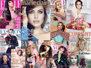
- 8. GenreConventions All magazinesfeaturedin themoodboardshowalltypeoffashionmagazinese.g. ELLE, GLAMOUR.The magazinesareallon thehigherend ofthefashiongenrethatmeansthesewouldcostbetween£4-£6.Themore expensivethemagazinethemore popularitise.g. VOGUE.That’swhy mostofthemagazinesthatare onthe moodboardare expensiveandverywellknown.Keyimagesusedareofcelebrity'ssuch asmodels,actresses andmusicartists– withhavingthestylemodernaswellmakessurethemagazinecompanyattractfemale teenagers/youngadults.Ifmodelsusedforthekeyimage arenotpopularthentheywillbeusedforlowerend company's.Asthemagazineson themoodboardareonthehigherendthentheywillhavetheleastamountof texton thefrontcoverasthesemagazinesare morefrequentlyboughtsotheydo notneedtopersuadethe targetaudienceasmuch aslowerend magazines.
- 9. ColourPalettes In this issue of the magazine interview three main colours have been used for the front cover – red, black and white. I think these three colours really compliment each other and make the magazine look artistic, bold and different from other magazine covers. The colours also give a smoky effect to the main image, almost giving the image a mannequin look. This magazine contains colours such as pink/red, yellow/orange and white. This gives the front cover a summer effect as these colours normally represent the sun. I think the colours go very well together and make the magazine look bright but gives an edgy feel from the position and pose of the main image.
- 10. The colours used on this issue of the magazine Bazaar navy, white and light blue. These three colours make the front cover look very modern and sophisticated, it makes the magazine look like its targeted at an older audience with the more basic colours. If it was targeted at a younger audience it would be much brighter and colourful. On this magazine cover the colours used are pink and grey. These two colours would not normally go well together making the magazine looking cheap and unstylish, however the grey and pink make it look trendy and cool. This magazine has a winter feel to it as the grey resembles a ‘white Christmas’ and the pink looks more like a red which is traditionally used at Christmas time.
- 11. This Icon magazine has used two colours: black and white. These two colours could of made the front cover look boring and dull instead it makes it look more modern and higher end as people use these shades very frequently for a lot of things. I think this magazine goes well with the main image being a male as it doesn’t look feminine – black and white makes the magazine very masculine as these are masculine colours. This front cover is made up of three colours: grey, pink and brown. The brown used for the font looks more golden when next to the pink and grey, these colours make the magazine look very different to others making it very unoriginal and new. These colours together are not frequently used but I think that is what makes this magazine look very different to others. I think this magazine looks very ‘old’ compared to the others due to the main image and the colours – but still stylish.
- 13. Fonts The fonts that Ihave chosen on the previous slides arealldifferent fonts used for magazine mastheads. The masthead fonts have tosuit the targeted audience andthe theme of the front cover which is different on every issue, especially in higher end magazines. The font ofthe masthead is always the same, such as Ellealways has the same serif font on every issue. This is so the targeted audience can easily recognise the magazine company, if the company is that popularthen sometimes the masthead can becovered up by the main image so only a bit ofthe font can be seen but still the audience can recognise the magazine. The fonts used for the anchorage text andthe text around the main image arealways slightly different tothe masthead’s font, it normallyis alot softer andnot as bold - it will only be bold if it’s asell line. When a font is picked to beas the masthead orthe other text featured on the front cover of amagazine that it has toactually fit with the genre of the magazine. For example, a children’s magazine will normally havefonts that arebig,bold andsofter sothe targeted audience can easily read the text. On a woman’s magazine the fonts areusually moresophisticated andprofessional this is because it will morelikely attract toolder woman andresembles their life.
- 14. AudienceProfile Aged: 18-29 Interestedinfashion,wantsall thelateststylesandwantsto know thebeststoresto shopfor goodqualityclothing at a reasonableprice. Getsfashioninspirationregularlyfrom purchasing many magazinesandaccessingthemedia. Favouritemagazineis Elledueto manyadverts promoting theirproductsso shegets a lot of ideas from thedifferentstyling. Prefersfashionmagazinesfor a lotof inspirationbut alsolike lookingat differentgenresto lookat the latestgossipaboutcelebrity's. Likes whenmagazinesaresimpleandbasicbut arestillinterestingby having differentimagesanda splashof colourwith text – likeswhen thingslooksophisticatedandnotchildish. Dislikeswhen thingslookunorganisedand unprofessional.Whenpurchasingitems theyhave to lookprofessionalwith a theme e.g. autumncolours,black andwhite throughoutthewholemagazine. My magazinehasto have manydifferentfeaturesto attracta lotof my target audience.It hasto feature fashionstylesforevery occasione.g. casual.Thisis becausethiswayit will suiteverybody– it alsohasto lookhigh endso thecolourshaveto go togetherand lookprofessional.
- 15. Target Audience Ihave decided that my targetaudience formy fashion magazine is a groupoffemales referred toas Trendies. Ipicked this groupas they want magazines that have the latest fashion styles and articles about celebrity’s and my magazine can providethat forthem. My targetaudience is for females aged 15-30 but is still suitable foranyone older which gives me a morevariety in my audience. Mymagazine is perfect for the Trendies group as it provides the tips about styling clothes for them, but as well as that it also provides inspiration todo their own thing. Mymagazine will also featured high brand shops such as Topshop, UrbanOutfitters which will attract this groupofpeople andwill make them enjoy reading the magazine.
- 16. Questionnaires I decidedto askthisquestionin my surveyasI thoughtif I knew what theaudiencewantedto seemore of in themagazinethenI could make surethat I met thoseneeds.From doing this surveyI realisedthat themajorityof peoplepreferseeingimages/picturesinmagazinesthen text or adverts.Mysurveysaysthat noone likeshaving advertsfeaturedin magazinesbut 10%of peopledon’tmindseeingtext next to an image orpicture, thisis becausethenthe image is explained.From looking at theanswersfrom respondentsI havedecidedto onlyuse smallpiecesof text for my magazinenext to big images. I askedthisquestionas I thoughtit wouldbenefitme whenchoosingwhat coloursto pickfor my front cover, I thought I could choosethecoloursthat hadthemost answersandseeif theywouldgo together.From looking at my respondentsanswerI can seethat I will not be usingorangeorgreen astheseare theleast picked colours– the coloursthat havebeenpicked themost areblack, white andred.I thinkthesecolours couldgo togetherto make themagazinelookdifferentto others.Looking at all theseanswersI can seethat thereis a massiverange of choicessowhenI dodecidewhat coloursto chooseit wouldn’treallyaffect the audience’sdecisiononwhetherto purchasethemagazine.
- 17. I decidedto featurethisquestiononmy magazinesurveyasI thoughtit would helpwith decidingwhat to have in my magazine. Byknowing what fashionsensemy audiencehaveI knowwhat kindof styleI shoulddo with the magazine,forexampleif the majorityof theaudiencehada fashionsenseof Gothmy magazinewouldbe mostlyblack andwould havegothic featurese.g.clothes.Themajorityof the audiencedescribedtheirfashion senseas HighStreetsomost of my magazinewill containthingssuch as Topshop,RiverIsland.However32% of peoplealsosaidcasualso asHigh Streetand casualarequitesimilarI will featurebothof thesestyleintomy magazine.I am doing thisashopefullyit will pleasemostof my audienceandso will sellmore magazines. Thisquestionisfeaturedonthe magazinesurveyasI thoughtif I knew what attractsanaudienceto a magazinethenI could make surethatthat’swhat the main focusis onmy front cover on my magazine.87% of theaudienceclearly saidthatthe key image onevery magazinefront cover catchestheireyeand makes them wantto butthe magazine.Thatmeansthatwhen doingmy magazineI'm going to make surethatthe key image isthe main focusand goeswith the restof the magazine.
- 18. I decidedto havethisquestioninmy magazinearticleasI thought it wouldbe usefulto know when decidingwhat to featurein my magazine,thiswill alsohelpwhentrying to decidea magazinecover. Mostpeoplebuymagazinesdueto the celebrityfeaturedin theissuethisis becausethe celebrityis normallysomeonetheylookupto or justwant to readaboutthem. By having a key image on