
Recommended
More Related Content
What's hot
Viewers also liked
Viewers also liked (13)
Similar to Magazine advert analysis
Similar to Magazine advert analysis (20)
Recently uploaded
Recently uploaded (20)
Magazine advert analysis
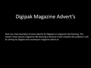
- 1. Digipak Magazine Advert’s Here are a few examples of some adverts for Digipaks in magazines like Keerang. The reason I have chosen magazines like Keerang is because it best matches the audience I will be aiming my Digipak and counterpart magazine advert at.
- 2. This is the magazine advert for Green Day’s single ‘Wake Me Up When September Ends’. Shows of the artist Shows the Digipak itself Consistent colour scheme Website references Ratings and sales Font style the same as the Digipak
- 3. Same font as the album Actual Digipak cover Actual Digipak cover Gives information about the Digipak The colour scheme is consistent to the Digipaks. This is the magazine advert for Fall Out Boy’s album ‘Believers Never Die’.
- 4. The same artwork as on the Digipak Gives the release date Gives website URL’s to buy the Digipak from Emphasis's the artist more than anything Everything is easy to read and consistent This is the magazine advert for Panic! At The Disco’s album ‘Pretty Odd’.
- 5. A common feature of the magazine adverts that I have found is that they all show the release date of the digipak as they obviously want to advertise it. They also all show what the cover of the digipak will look like so that the audience knows what to look for when searching for the digipak. All their fonts are consistent to the bands logo’s so that they are recognisable. I shall use this research in order to assist my magazine advert. I like the way the green day advert showed the artist and I’d like to use that in mine. I will also use a consistent font across my music video, digipak and magazine advert. For advertising purposes, I shall show the date of the release of the digipak just like the examples I have analysed here.