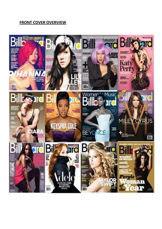
2. In order to dig deeper in to my research, I thought a front cover overview would be a good
idea. It will allow me to find out the symbiotic link between front covers of a particular
magazine, and also the codes and conventions they use to address their audiences. I will be
looking at 12 front covers from the Billboard magazines, as it is similar to the magazine I
intend on creating. It is aimed at a female audience who have an interest in RnB/HipHop
magazines.
The 12 front covers all feature typical magazine front cover conventions. We see expected
and layout conventions, such as a main image that dominates the front cover, sell-lines that
surround the main image and a masthead in a conventional place and appropriate font.
Most of the magazines of Billboard feature a female artist, this clearly shows who it is aimed
at. Also, there is a constant appearance of solo artists. This indicates that bands are rare in
the industry of RnB and Hip Hop as most artists sing solo. In terms of costumes of the artists,
it is mainly a dress they wear. This adds to the femininity and continuity of the magazine.
Another feature that crops up again n again is the masthead. It is the same font each week,
however the colour varies. It is either white or black depending on the colour scheme of the
magazine. The circles on the letters ‘b’ ‘o’ ‘a’ and ‘d’ are coloured in the same font each
week; red, yellow, blue, yellow. It is positioned in the same place as well. Most of the time
the main image covers the masthead, this makes it possible to only see a few of the letters.
As the magazine is well known, audiences are able to recognise the magazine from the style
and from few of the letters so it becomes conventional for some of the letters be head and
continuous brand identity.
The main sell-lines of Billboard are the names of the artists. They are in a place where eyes
can be lead to first, and after seeing the main image, audiences would like to know who the
artists is if they don’t already. This has also become the magazines convention as it occurs in
all of the 12 magazines above. The sell-lines of the magazine focus on the success of the
artists and other features related to music, rather than gossip about them. This displays the
target audience of the magazine as an older audience would not really like to read about
gossip. They would want to read something inspiring.
All 12 magazine covers also have a plain background. This makes the audience concentrate
on the main image and easily be able to read the sell-lines on it without struggling. This has
also become the magazines brand identity. For example, if Billboard where to have a main
image with a city background, it would not share a symbiotic link between the other issues
of its magazines.
In conclusion, it is common for a magazine to continue its brand identity and follow their
conventions in each issue.