
Recommended
More Related Content
What's hot
What's hot (18)
Viewers also liked
Similar to Solange Knowles Double Page Spread
Similar to Solange Knowles Double Page Spread (20)
Recently uploaded
Recently uploaded (20)
Solange Knowles Double Page Spread
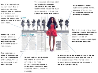
- 1. This is a double spread page showing Solange Knowles. It uses a very fundamental colour scheme of complementary colours such as black red and blue. These colours are prominent and attract the reader’s attention as they go well together and praise the main image because it is the only part on the page with colour. In addition the main image is slightly on the right of the double spread and the size is very generous compared to the other images, which is drawing the attention of the reader immediately. The bright blue is used to highlight the most important parts of the article. These are the name of the artist and the There are seven pictures of her in different positions, which shows the reader she is full of personality. This is a stereotypical hip hop artist. She is black, and also the position she is standing in is quite sexual mostly because her hands are behind her back and she revealing some flesh. As you can see the most of the writing is on one the left side of the page because the main image is on the right hand side. This gives the article a sense of balance. the magazines target audience must be trendy because of the type of the standard of clothing Solange is wearing.
- 2. The main concentration of this double spread page is the image. It is clearly aimed at the younger generation because they are familiar with his work, and will be interested. This magazine follows the conventional C type layout. This is when the main heading is on the top right and the picture is on the middle left side and then finally the writing is on the bottom right side. The effect this has it is very easy on the eye and very clear. There is use of colloquial language in the main heading of the double page spread ' Over here husltlin' this is slang. The artist also uses words like ‘okay’ and ‘its good’ which is language we hear everyday. This makes the artist more relatable to the reader. The mode of address is comfortable as the interviewer is addressing the artist as a friend rather than an actual interviewer. The plain white background creates a simplistic feel. Also it looks good with the artists clothing. A white background is purposely used to attract a mature audience. This is because his fan base is mostly teenagers, and they are trying to promote him (and their magazine) to a more mature audience who are more likely to afford their prices. There is a drop cap at the start of the article, this is a traditional method used to capture the reader attention. Also the big, bold, black stand out and really is a great finishing touch to the layout of the magazine and the colours used. The mask on his face automatically catches the readers attention because it is interesting and different. Also it add a sense of mystery to the artiicle. On the other hand the artist is watching straight into the camera which build a bond between the reader and the artist.
- 3. The double page spread has a very professional photo of the rappers, and 50cent (left) is standing behind the young rapper soulja boy (right) as the father figure, because he is older in age. There body language is making them look as though they should not be messed with and are very serious, also they look as if they are welcoming any potential competitors. The main cover line has lots of swear words which have been blanked out but are still able to read, I think this has been done on purpose as this is the type of language used in this hip hop ‘gangster’ culture and they are using it to represent rappers. Also they are used to show how aggressive and competitive this genre of music is. A conventional C type layout has been used in this double page spread so that the reader finds it easy to absorb all the information. This also connotes seriousness. This is a very stereotypical Hip Hop/R&B artist because they are of a black origin . Also the artist are wearing expensive jewellery and designer clothing which is very common in the rap music culture, because the artists feel as if they have to show off their money in order to put of other artist who compete with them.