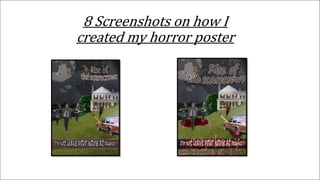
2. These are the eight
screenshots that were asked of
me to provide evidence for the
hour poster design that I
created in Photoshop. I forgot
to take some screenshots
along the way when creating it
so I've just went back and
chose the main things that
really made a difference to my
poster. This first screenshot
shows the stroke tool which
creates this outline around
your text basically giving it
this kind of boarder, id say
this was one of the main parts
of my design as it makes my
titles stand out more and with
one of them being red it adds
to the them of it being horror
based.
3. The next screenshot shows the
filter I chose, there were two,
one for the first design and
another for the second. The
first filter was called cut-out
which has been used on the
striped back version of the
poster, Iv used this filter
before and I'm really fond of
it, it just creates this sort of
comic vibe and that how I like
my movie inspired posters
being. The first version with
the cut-out filter makes poster
look more smart in my
opinion, its just suitable filter
which ties all your chosen
objects time together more
making it look like an actual
poster.
4. The second filter I chose
was called palate knife,
even though I kind of
prefer the other filter
more this filter does make
it look more like the old
horror poster we were
looking at, overall both of
the filter were really
useful and without them I
wouldn't of been able to
make this poster. Id say
that this filter was
successful because it links
more to the old versions
of horror posters so those
that were in the 50’s and
60’s just for that there is a
lot more going on just like
the old versions and the
texture of the poster is
also like those in that era.
5. The forth
screenshot is just
of the brightness,
only used because
normally horror
poster are dark so
bringing that down
just suits the
criteria.
6. Text was a big part of
this poster, to make it
even more advanced
the warp tool was very
useful in making it
more like the olden
days posters. It just
makes your text more
rounded making it
more curved, one
thing I need to
remember is that it
doesn't need to be
rasterised, I got
confused thinking
that it had to but it
doesn't.
7. The paint tool is
what the sixth
screenshot is, I used
it to add "blood" to
the scarecrows and
the pitchfork which
I placed in the
wheel, small
features like that
just really add to
your design.
8. Changing the fence
post to black and
white using the black
and white tool which
is in adjustments was
something that I was
told to change to
make It more dark,
you can see the
difference between
them looking at the
two different
versions, I'm not sure
which one I prefer but
its just a feature
which chows that you
can change the colour
of something
completely.
9. The final screenshot
consists of something
that I used the most, the
vector mask tool which is
basically just like the
rubber but you can
change it to either black
or white in the left hand
corner, white gets rid of
the image and you can
get it back using the
black, without it I
wouldn't of been able to
refine the edges of all the
images I used.