
Recommended
More Related Content
What's hot
What's hot (20)
Similar to Question 2 media
Similar to Question 2 media (20)
Recently uploaded
Recently uploaded (20)
Question 2 media
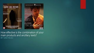
- 1. How effective is the combination of your main products and ancillary texts? BY SAM READ
- 2. Trailer and Poster The picture in my poster links to my trailer very well as the poster reveals the antagonist which is seen in the trailer. The black figure is seen a lot of times in the trailer so when people look at the poster, they will know that it is from the same film as the trailer. This is important as both the trailer and poster need the same theme and have the same characters in them. I chose to have the antagonist on the poster as it is the scariest part of the trailer and also creates an enigma for the film. I feel it was the best choice to have the black figure as it is the main thing the audience want to see more of and also learn about. I feel the dark look also links with my trailer as most of my trailer has a dark setting.
- 3. Trailer and Magazine My trailer and my magazine also link well as the main character is present in the magazine cover. Due to the choice of picture, the audience will immediately recognize that it is from the ‘Soul Catcher’ trailer. The picture I used has a big part in the trailer as the audience can finally see what the antagonist is doing to the main character. The picture is from a scene which helps develop the trailer and brings the story to life with the cut on his chest. The cut on the front cover was effective as it is a focus point of the trailer, and the audience will want to see the cut with more detail to understand what the antagonist has done. This builds excitement around the film as the audience can see some of the extreme things that happen in the film, and will want to see how the story turns out.
- 4. Magazine, poster and Trailer The magazine and poster have different pictures with different characters but both have a dark theme. The audience will be able to link each product to each other as they all have similarities. There is a darker theme within each of the products which implies that it will be a dark, scary film. The characters seen on the poster and magazine are both seen for a prolonged amount of time in the trailer, which means the audience will instantly know where the characters are from and link them together. It was important to have images on the magazine and poster that links with the trailer as all the products had to look like they are representing the same film.
- 5. Targeting My audience In all three of the products, I use themes, effects and sounds which will appeal to my target audience. I used codes and conventions of real media products to ensure that the things that are included in my projects will appeal to the target audience for my film. I used correct sound effects in the trailer to ensure I build suspense and also scared the audience. I used dark, scary pictures on my magazine cover and on the poster to get the attention of my target audience. I used horror themes fonts on the magazine and poster to ensure that the products looked like they were a horror theme. This was important as the poster and magazine need a horror theme to appeal to the correct people, and I feel like the effects and techniques I used will appeal to the correct audience.