
Recommended
More Related Content
What's hot
What's hot (20)
Viewers also liked
Similar to Question One
Similar to Question One (20)
More from beccahodson
More from beccahodson (17)
Recently uploaded
Recently uploaded (20)
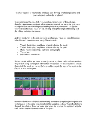
Question One
- 1. In what ways does your media products use, develop or challenge forms and conventions of real media products? Conventions are the expected, recognised and known way of doing things, therefore a genre convention is what we expect to see from a specific genre. An example of this is how we expect to see voyeurism in pop videos. The typical conventions of a music video are lip-syncing, fitting the length of the song and the editing matching the music. Andrew Goodwin’s codes and conventions of a music video are one of the most relatable and relevant around today. These include: Visuals illustrating, amplifying or contradicting the music Visuals illustrating, amplifying or contradicting the lyrics Music videos displaying a style and iconography Voyeurism Intertextual references In our music video we have primarily stuck to these code and conventions despite not using any explicit intertextual references. To make sure our visuals illustrated the music we cut on the beat and increased the pace of the shots in the chorus to match the speed. Our visuals matched the lyrics as shown by our use of lip-syncing throughout the performance section and occasionally in the narrative section. This is best shown through the shot of Tom, our male character, lip syncing “its nothing” with lip stick round his mouth as described in the lyrics.
- 2. The iconography we illustrated throughout was group unity, which we showed through the nine spilt screens of the girls around Tom, this style was the bases of my ancillary tasks. The conventions of a digipak are much simpler than those of a music video. The majority of digipaks will have 6 panels although some do only have 4. From the digipaks I analysed in my research I discovered that it is conventional for a digipak to have one colour theme, a barcode, legal details in small print, the artists name as a focus and for the convention pop for an image of the artist to be the front cover, often a close-up or mid-shot with direct address.
- 3. Despite the majority of black and white digipaks being from the indie genre I wanted my images look sleek and classic which is an effect that a black and white filter does, even too a man smoking. This unconventional route is one that artists such as Adele have chosen to maintain a classic image. I have included the record label logo,barcode, a full sound track list and a font that is then repeated on the album advert to follow the contentions and make my digipak look realistic, as well as including 6 panels. Despite genre, band or solo the majority of album adverts follow the same conventions; the artists name, albums name, release date/out now, reviews and imagery related to the digipak. I have conformed to the majority of these conventions in my advert except I didn’t include reviews as the style didn’t fit any necessary writing and I wanted the focus to be on the “#1” Comeback.
- 4. Unlike the majority of pop adverts I didn’t follow the conventions of my chosen genre as I didn’t include any images of the artist. However by including shots from the music video as well as repetition of the spilt screen I created consistent iconography throughout my three products. By following conventions it will offer the audience satisfaction due to the familiarity of the product. This combined with the conventions I have no included will create a product that is familiar yet new therefore will entice the audience to look at the product, which will hopefully lead to its purchase.