Kolkata Call Girl Bagbazar 👉 8250192130 ❣️💯 Available With Room 24×7
Print Production
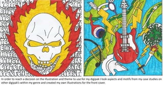
1. In order to reach a decision on the illustration and theme to use for my digipak I look aspects and motifs from my case studies on
other digipak’s within my genre and created my own illustrations for the front cover.
2. I decided on a drum flames and bright colours to be reoccurring theme in my digipak as I had seen this in many of the albums
from my case study. Also deciding on a drum kit as a focus on the front cover in order to tie in my music video and suggest that
this track would be the ‘feature’ track as many artists do.
Bellevue Days
Ripped Jeans
Pepper Tea
Something New
Gratefully Gracious
Made from the Devil, Heavy
Metal
Font: American Purpose. I used this font as it is
clear and dramatic such as the Killers back cover
seen in my case studies, along with many others
that use this technique.
FRONT INSIDE BACK
Font: Meltdown. I used this font as it goes with the ironic
postmodern aesthetic I wish to create and contrasts nicely
with the shape use of American Purpose for the song titles,
making the band name eye catching which is important in
establishing a brand.
I used the same
colours throughout to
tie in each slide and
create a overall theme.
Taking aspects and themes from the eye catching and complex
front cover doesn’t overload the senses by still gives an
opportunity to introduce and develop the brand, linking all slide
together.