
Recommended
More Related Content
What's hot
What's hot (20)
Viewers also liked
Similar to Digipak Design Analysis
Similar to Digipak Design Analysis (20)
Recently uploaded
Recently uploaded (20)
Digipak Design Analysis
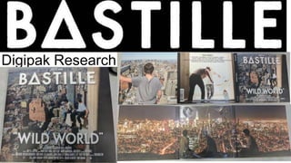
- 2. The record label name is clearly shown in small writing just above the band name. The stencil typeface is used consistently throughout the overall design of the Digipak and is used consistently across all bastille products. The DigiPak uses an image that is relevant to the album itself “Wild World”, using a link between visuals and lyrics as suggested by the theorist Andrew Goodwin. The title of the Digipak itself is in quote marks, suggesting a link to these words being spoken and in one of the songs included in the Album, “Warmth” the lyrics “hold me in this wild , wild world” are used. Creating a somewhat easter egg as in fact only true “fans” will understand therefore using these quotations to “target” this specific fan base. The production and studio credits are clearly shown at the bottom of the album, most albums would usually place these on the back. However Bastille do not, creating a somewhat sense of them actually being used as a somewhat credits to the album almost acting as a somewhat film. Now this is particularly interesting because Dan Smith (The lead singer of Bastille) is in fact a “movie addict” as he describes it and does include countless references to TV Programs and movies. Therefore suggesting to the “fans” that this is in fact a somewhat movie. The title of the Digipak itself incorporates specific iconography used consistently throughout Bastille products this is in fact the △ used instead of an “A” Front cover of Digipak
- 3. The back of the Digipak does in fact follow specific conventions such as a Barcode, these are usually placed on the back and are needed for purchase. The spine includes clear band name along with the title written in the style on the front creating consistency throughout the overall design of the Digipak. Also at the end there is a code “CDVX 3159” after some research this is in fact the album's specific identification tag and are placed on most Album’s meaning this convention will be particularly important throughout the construction of my Digipak. Along the back of the Digipak there is a list of all the tracks included, this seems to be a repeating convention used throughout. What is particularly interesting about this is that it still incorporates the specific “△ ” icon as a replacement for an “A” showing that the design throughout has been carefully considered. Upon opening the Digipak we are shown a character overlooking New York City, creating a somewhat narrative as you turn through the covers the character’s continue to move, as shown. This is particularly interesting as mentioned before the album seems to have a somewhat film like style to it. Back of Digipak
- 4. Inside of Digipak In the centre of the Digipak there is a cutout for the CD this is a convention used throughout most digipaks. The inside art features three males sitting overlooking the New York skyline. Therefore following the sense of narrative created through the Digipak, this is because the characters throughout have been “moving” from cover to cover and now seem rested on a ledge all together.