
Recommended
More Related Content
What's hot
What's hot (19)
Viewers also liked
Similar to Evaluation Question 1
Similar to Evaluation Question 1 (20)
Recently uploaded
Recently uploaded (20)
Evaluation Question 1
- 1. In what ways does your media product use, develop or challenge forms and conventions of real media products?
- 2. DigiPak I decided to follow the media conventions of a Digipak by staying with the familiar and actual shape and size of a CD and CD case; this is because I didn’t want it to look different as by doing this although it may have stood out more it would possibly be unrecognised as a CD. I also followed the conventions of a pop genre digipak by having only the artist on the cover of the CD rather than many people.
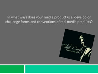
- 3. DigiPak- CD Cover When I was making my DigiPak I researched into the images used on others I liked the image used on the Sam Smith In The Lonely Hour album cover so I decided to use a similar image by having a picture where Charlie wasn’t looking directly at the camera by looking down instead. This creates a mysterious and uncertain feel attempting to make the audience interested in the CD. I also liked the dark and plain background used on the In The Lonely Hour CD so I used this effect on my CD cover by using a blacked out background giving It a professional studio feel. I used a handwritten font for the artist name and album name to give it a personal effect and to keep the CD cover simple.
- 4. DigiPak- Back Cover Again I looked at the same Sam Smith DigiPak for the back cover of the CD. I liked the black background effect used as it is consistent with the image used on the front of the CD cover. Here I followed the conventions of a CD back by using a barcode at the bottom so that it can be scanned and purchased in a shop. I have also included copyright information from the record label and a website where people are able to find more from ‘Theo Carter’. I also followed the convention of listing the song names in order to show the audience what songs are on the CD. But I have slightly developed this convention by using serif type hand written font rather than a sans serif font which are usually used as they can be seen clearer but I wanted to have continuity throughout my DigiPak as I had
- 5. DigiPak- CD I have followed the convention of a CD by using the correct sizing and measurements to make sure that my CD is the right size. I have slightly challenged the convention of a CD as most have a plain colour background with text over the top but I wanted to use an image on mine as I liked the image but I also blacked out behind the image to make it one colour. Instead of including both the artist name and the album name again here I used just the album name in the same font I have used throughout to create consistency and so that it is simple but effective.
- 6. Music Video When making my music video I followed the conventions of a pop music video by using multiple different shot types using different camera angles. This is something I saw a lot during the research and planning process where almost every music video used a range of camera angles to represent different things. To do this I filmed from many different positions and used different camera lens to get a variety of extreme close up, close up, mid angle and wide angle shots throughout my video. I developed the conventions of a pop video by choosing to make my music video a narrative rather than a performance piece. The way I made my video is so that it runs through from on a storyline from start to finish rather than being a collection of videos.