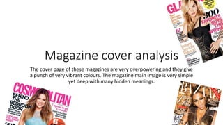
1. Magazine cover analysis
The cover page of these magazines are very overpowering and they give
a punch of very vibrant colours. The magazine main image is very simple
yet deep with many hidden meanings.
5. Masthead
Masthead is the title of the the magazine that is the most prominent text which is written in
dark or funky colours to make them more eye catching. It is usually written in simple font to
make it look more appealing and bold on white background. The masthead the same in every
magazine issue. Usually the master heads are half covered.with the main image because the
editor might think that he doesn't need to show the full name of the.magazine because it is
already well known. Analysing the magazine cover pages that I have I have come to an
conclusion that mostly all the mast heads of the magazine are in pink because pink shows
feminism and the colour represents women .To make the mastheads look more funky and eye
catching they’ve changed its colour to pink. Popular magazines sometime change theyre
6. Cover line
Cover line usually gives a hint about the
articles in the magazine. It is written in bold
and in a different colour so that it appeals
the reader as soon as he looks at the
magazine cover. After analysing the three
magazine cover pages I have chosen I’ve
noticed that the cover lines are written to
create a mystery in the readers head for e.g
in the first cover line it says 7 pieces you
need and don’t own this caption will make
the reader curious and want to find out that
what are those 7 new trendy pieces that I
don’t own. Similarly the second cover line
says’ your ultimate sexy hair guide which will
instantly tell the reader that this magazine
might contain an article with hair tip to get
sexy hair.
7. Main Image
Is picture is the main picture
that usually features a celebrity
to make the magazine look
more attractive and to catch the
audiences attention. In all three
magazines main image the
models are very bold and
glamorous to show the latest
trends. All three magazines
feature well known
models/celebrities to make the
magazine more eye catching
and the reader might buy the
magazine just because of the
celebrity on the cover page.
8. This cosmopolitan cover page features a reality show star Khloe Kardashian one of the famous kardashian
Sisters who are known for their style and glamour. The expression on her face
shows how happy and satisfied she is with her fashion sense on fleek. The cover lines then
expose that khloe Doesn’t need any fashion advice.
This Glamour magazine cover page features model/actress Kate. The look given to Kate
In this image is very bold and revealing to attract the readers. The expression on her face
Are very serious and bold. The reason why she might be wearing these clothes is because
They want to show her body shape and figure.
This magazine cover page is featuring Beyonce whose a very famous
singer. In tis image beyonce has been given a very bling bling and
flashy look and the expression on her face is easy breezy and carefree.
Her make up is also done to pefection and she has been given a very
subtle look. Beyonce is wearing figure hugging clothes because she
wants to expose her body as it says in the cover lines too sexy and
pregnant which shows that they might want to show her baby bump
which is why they
9. Main Cover line
The main cover line basically
highlights the main content of the
magazine. The line font is bold so
that it immediately catches the
audiences attention. The three
different main cover lines give a
small sneak peak of the content
inside the magazine like the first one
says "the right bag and shoe buy
now" this might encourage the
customer to buy the magazine
immediately thinking that they might
get some fashion advice from
Beyoncé. The other magazine says
"the fashion edit" it might give a
small hint to the audience the the
model khloe kardashian might give
them some tips about the latest
trends.
10. Puff
Puff is put on the corner of the
magazine. It is like a stamp that
highlights the text since it is written
in a different colour font and the
sticker colour is also different then
the cover page so that it is more
appealing to the eye. The puff is
usually put to promote something
inside the magazine, to make the
reader more curious about the
content inside the magazine. The
first puff says "6 steps to sexy hair"
by reading this the reader will be
more curious to know some new hair
tips.