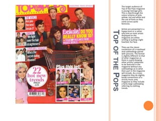
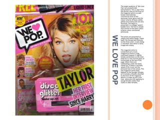
RESEARCHING GENRES
Researching different magazine genres/ sub genres.
The target audience of
Top of the Pops magazine
is young/ teenage girls.
This is clearthrough the
colour scheme of pink,
yellow, red and white and
the use of fonts as they
come across quite
feminine.

TOP OF THE POPS

Artists are presented in a
happy tone or a rather
silly tone as most artists
displayed on the
magazine are either
smiling or pulling a light
hearted, fun face.
They use the classic
convention of a masthead
and subheadings paired
with pictures. The format
is slightly different to that
of other magazines as
there is a grid showing
other artists/ celebrities
to be featured in the
magazine without any
subheadings as to what
their part in the magazine
will include. As a music
magazine they do slightly
break conventions of a
strictly music only
magazine as they include
a fairly large subheading
referring to clothing
trends.
MIXMAG

The target audience of
MixMag are young males
ranging from the age of
16/17-30. This is clear
from the picture used on
the front of the magazine
which is a well known
band of this particular
music genre and the
colour scheme of black,
white and grey are more
manly than feminine. The
layout is presented in a
block form. The font is
simple and consists of the
basic colour scheme
colour mentioned
previously.
The artists are presented
as older and
sophisticated. As a
collective band, the
artists are portrayed as
quirky within the picture
as they are wearing a
mixture of sporting
clothes, as musicians.
The magazine sticks to
conventions of a music
magazine as when there
are subheadings under
the band names etc, it
sticks to a topic involving
music and not their
personal lives etc as other
magazines such as Top of
the Pops does.
The target audience of ‘We Love
Pop’ are young female
teens/tweens. This is clear from
the picture used on the front of
the magazine which is a well
known international,
commercial artist of this
particular music genre and the
colour scheme of black, white,
yellow and mainly pink are very
feminine. The layout is
presented in a collage/ speech
bubble form. The font is simple
and consists of the basic colour
scheme colour mentioned
previously.

WE LOVE POP

The artists are presented as
cheesy and overly happy. Taylor
Swift, the female who features
on the front cover, is seen doing
a “shocked” face which is fairly
cringe and cheesy.
The magazine sticks to
conventions of a music
magazine as there is a big
masthead however it slightly
breaks conventions as the mast
head isn’t in the normal place of
horizontally at the top of the
page. When there are
subheadings under the band
names etc, it doesn't normally
speak of the music but the
personal lives of the artists. This
pop magazine particularly
appeals to the younger females
as it includes a freebie attached
to the front of the magazine
which is a make up set in this
case- obviously only applying to
young females rather than
males or older females.

Researching genres

  • 1.
    RESEARCHING GENRES Researching differentmagazine genres/ sub genres.
  • 2.
    The target audienceof Top of the Pops magazine is young/ teenage girls. This is clearthrough the colour scheme of pink, yellow, red and white and the use of fonts as they come across quite feminine. TOP OF THE POPS Artists are presented in a happy tone or a rather silly tone as most artists displayed on the magazine are either smiling or pulling a light hearted, fun face. They use the classic convention of a masthead and subheadings paired with pictures. The format is slightly different to that of other magazines as there is a grid showing other artists/ celebrities to be featured in the magazine without any subheadings as to what their part in the magazine will include. As a music magazine they do slightly break conventions of a strictly music only magazine as they include a fairly large subheading referring to clothing trends.
  • 3.
    MIXMAG The target audienceof MixMag are young males ranging from the age of 16/17-30. This is clear from the picture used on the front of the magazine which is a well known band of this particular music genre and the colour scheme of black, white and grey are more manly than feminine. The layout is presented in a block form. The font is simple and consists of the basic colour scheme colour mentioned previously. The artists are presented as older and sophisticated. As a collective band, the artists are portrayed as quirky within the picture as they are wearing a mixture of sporting clothes, as musicians. The magazine sticks to conventions of a music magazine as when there are subheadings under the band names etc, it sticks to a topic involving music and not their personal lives etc as other magazines such as Top of the Pops does.
  • 4.
    The target audienceof ‘We Love Pop’ are young female teens/tweens. This is clear from the picture used on the front of the magazine which is a well known international, commercial artist of this particular music genre and the colour scheme of black, white, yellow and mainly pink are very feminine. The layout is presented in a collage/ speech bubble form. The font is simple and consists of the basic colour scheme colour mentioned previously. WE LOVE POP The artists are presented as cheesy and overly happy. Taylor Swift, the female who features on the front cover, is seen doing a “shocked” face which is fairly cringe and cheesy. The magazine sticks to conventions of a music magazine as there is a big masthead however it slightly breaks conventions as the mast head isn’t in the normal place of horizontally at the top of the page. When there are subheadings under the band names etc, it doesn't normally speak of the music but the personal lives of the artists. This pop magazine particularly appeals to the younger females as it includes a freebie attached to the front of the magazine which is a make up set in this case- obviously only applying to young females rather than males or older females.