1. STEP BY STEP OF
FRONT COVER:
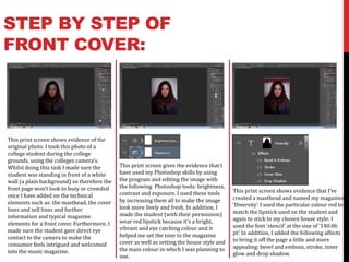
This print screen shows evidence of the
original photo. I took this photo of a
college student during the college
grounds, using the colleges camera’s.
Whilst doing this task I made sure the This print screen gives the evidence that I
student was standing in front of a white have used my Photoshop skills by using
wall (a plain background) so therefore the the program and editing the image with
front page won’t look to busy or crowded the following Photoshop tools: brightness,
contrast and exposure. I used these tools This print screen shows evidence that I’ve
once I have added on the technical created a masthead and named my magazine
elements such as: the masthead, the cover by increasing them all to make the image
look more lively and fresh. In addition, I ‘Diversity’. I used the particular colour red to
lines and sell lines and further match the lipstick used on the student and
information and typical magazine made the student (with their permission)
wear red lipstick because it’s a bright, again to stick to my chosen house style. I
elements for a front cover. Furthermore, I used the font ‘stencil’ at the size of ‘140.06
made sure the student gave direct eye vibrant and eye catching colour and it
helped me set the tone to the magazine pt’. In addition, I added the following affects
contact to the camera to make the to bring it off the page a little and more
consumer feels intrigued and welcomed cover as well as setting the house style and
the main colour in which I was planning to appealing: bevel and emboss, stroke, inner
into the music magazine. glow and drop shadow.
use.
2. CONTINUED…
At this stage, this print screen This next stage, shows a print In addition, this stage shows
gives evidence that I have screen in which I give evidence that evidence that I have started
included a barcode on the bottom I have included the following: the thinking of sell lines/coverlines in
right hand of the front page. This magazine price, the magazine date which I was including on my front
is because it is a necessary and issue, shot and sweet sell cover. This print screen shows that
element for every magazine cover lines/words on he banner at the have started to placed and align
to have because it ensures that my bottom of the front cover. The date them to make them look neat and
magazine cover as the typical and and issue number is important professional. I have used the font
expected elements of a magazine. because it reassures the consumers ‘stencil’ in which I used for my
Secondly, the print screen also that it’s the latest issue to be masthead so therefore keeping to
shows that I have included a black released telling them that the my original house style. I used the
coloured, blocked out rectangle at information included is new, fresh colour white with a black stroke
the bottom of my front cover, it’s and up to date. In addition, the affect which made it stand out
there to be a background for words on the banner are there to more and seem to be more off the
further short pieces of entice the consumer into further page, making it more noticeable.
information in which will intrigue buying this issue of the magazine
the consumer and persuade them as it feeds them small offers which
to purchase this specific issue. will persuade them.
3. CONTINUED…
This print screen shows evidence This screen shot is giving evidence This screen shot shows evidence
that at this stage, I continued to add that I have included ‘plus’ above that I have included the main
more coverlines to fill in the dead one of my sell lines. I have included coverline to the front cover which
space of the front cover, however, I this because it emphasises that is a key element for a magazine. My
didn’t over fill it by putting too there’s even more interesting main coverline is ‘EXCLUSIVE
much information or writing on information to find out and it’s INTERVIEW!’ which screams out to
there. On one coverline I there to intrigue and attract the the consumer due to the fact that
emphasised the ‘186’ to give a consumer by giving little away but it’s in capital letters, it’s bold, and
sense of importance and that it’s a enough to persuade them to buy takes up a fair bit of the page
necessary piece of information. the issue. The word ‘plus’ is in a compared to the other coverlines.
Furthermore, I added a shape of a different colour to the other Furthermore, I have continued
cross which stands for ‘plus’, my coverlines, it’s in red which is still with the house style by using red
reasons for this was to further fill in sticking to the original house style and white, overwriting the main
dead space instead of placing more yet is the opposite to other image, however, it doesn’t take
text as well as it being there to link coverlines making it more away the affect of the image or any
two coverlines together, I chose it to important and noticeable. major part of the image leaving it
be black because it’s bold and to be affective and professional.
stands out.
4. CONTINUED…
The image to the right is
the final magazine cover
with all the typical
magazine front cover
elements in which are
necessary to make it
This print screen shows evidence professional and
that I have added to the main successful.
coverline but also made it personal
and original. This coverline is the
artists, on the front cover, name
‘Sophie D’. I have edited this to
make it into a different font and
added a italic affect on his to make
it look more like the artists
individual style or
autograph/signature.
5. STEP BY STEP OF THE
CONTENTS PAGE:
This first print screen of my This print screen of my contents This print screen of my contents
contents page shows you that I have page shows you that I have page shows you that I have
pretty much divided the page up partially completed the entire left continued to divide the page
into the rule of thirds so that the third of the page by placing the further into the rule of thirds and
layout looks neat and professional. results of the top ten singles in filled in the bottom left corner of
Furthermore, I have included the the charts which is a main thing the left third by writing a editors
contents title and used the same people want to know whilst note to the readers which is
font as the front cover masthead reading a music magazine. In expected and usually occurs in the
which was stencil as well as using addition, I have included a quote magazines contents page.
the same colour to keep a from the famous and well known Additionally, I have filled in the
consistence of the house style. On artist ‘Rihanna’ , quoting her view bottom two thirds of the page by
the top left corner of the page I have on music and the music industry writing the page numbers and
inserted the masthead of the which makes it more direct and what each page contains so
magazine cover except changed the personal, it says “music is my therefore the reader knows what
font colour to white to make it clear inspiration in life”. pages to find certain information
on a black background. out.
6. CONTINUED…
This print screen of my contents This print screen of my contents
page shows you that I have included page shows you that I have filled in
and added images which is my the blank space of the page with
original photography of students venues where gigs/concerts will
within the college grounds and link take place so it’s giving little
to music. I have set these out to fit information away, again to keep the
precisely into the rule of thirds which reader intrigued and persuaded to The image above is the
makes the page look more buy the magazine to find out
professional and neatly laid out so further information such as concert
completed version of my
that the reader doesn’t get confused. dates and which artists are doing contents page which is
I have made sure it’s all fairly spaced concerts and what particular successfully laid out into
out and not too crammed together so venues they will be performing at.
the rule of thirds keeping
it’s easily readable however, there’s Whilst including this I have stuck
barely any dead space which is what with the original house style by the look of
you want for a magazine contents using the font ‘stencil’ and the professionalism.
page. colours red and black on white.
7. STEP BY STEP OF THE
DOUBLE PAGE SPREAD:
This print screen of my double page This print screen of my double page This print screen of my double page
spread on In Design, shows you that I spread shows you evidence that I spread shows you evidence that I
have inserted the main focused image have further added elements to it. have set the right page out into the
of the student (artist) which will Such as, underlining the heading of rule of thirds which I have consisted
locate and take up the entire left page the page, making it stand out more throughout all three pages in which I
of the spread. She is holding a and point out the importance and have created and designed. I have
microphone which links straight to reasoning of this double page spread. used the interview in the font colour
music and singing reinforces the Additionally, I have added an of white as it’s what stands out on
whole magazine. Furthermore, I have introductory paragraph, outlining the background colours, as well as
filled the page on the right with a what and who the article/interview is fitting in with the house style and
burnt red background colour with the about and a bit of background representing the idea of freshness
heading being the magazine information on them, informing the and the newness of the music
logo/masthead of the front cover and reader the basics of their story and included within the magazine. Also,
the word exclusive-reinforcing the life. I have began this paragraph by the questions I have edited into a
interview and coverline on the front using the drop cap tool on the first bold text so it stands out from the
cover, again the colours used are using letter ‘Y’, adding the professionalism answers and makes it easier to
the original house style I chose. to it as that’s what magazines include. follow and read.
8. CONTINUED…
This print screen of my double page This print screen of my double page
spread shows you that I have included spread shows you that I have included a
information telling the readers who’s pull quote from my text/interview and
photography has being used and who placed it on the left page on top of the
the interviewer was. Additionally, I photo in the left hand corner which will
have included a second, subsidiary gives the readers an incite into the
image of the same artist yet in another particular artist as it’s one of the first
position/pose. This image I have edited things they’ll see, this will persuade
into a photo with a black border round them and make them more eager into
it to reinterpret the traditional photo reading the entire interview. I have also
and I have rotated it slightly to the included the page number on the bottom
right to add more affect and make it left page in the corner.
more interesting, which ties in the
whole page.