Nell’iperspazio con Rocket: il Framework Web di Rust!
Question 1
1. Evaluation- Over view analysis
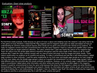
My final three media products, firstly because my genre of music is dance and clubbing music the research I was doing had to be
in this genre of music therefore I researched Mix Mag magazine and DJ magazine these gave me ideas and helped me have an
understanding for all three media products layouts which would suit my genre and connect to the interest of my audience. To
make my magazine connect and look conventional that it was the same magazine I kept to a vibrant and nightlife colour scheme
which would grab my target audience’s attention. The colour scheme that I used was mainly the colours of my magazine logo
‘Rush’ the colours from the strobe lights behind it therefore throughout used the same shade of the colours on all my media
products also I made the colour scheme connect with my mise-en-scene and props from the images and photo shoots. These
colours would entice my audience as it’s youthful and exciting. To make it conventional and look like a real media product I added
page numbers to show continuity. I used the same model/artist on my front cover and double page spread as my main image on
my front cover states who the double page spread is about so it wouldn’t be conventional if on my double page spread I had a
total different story line and artist also this would confused my audience. However, on my contents page I used different images to
make it conventional I talked about what information and other artists and events would be on other pages in the magazine
because it would be unconventional to have the same artist because that shows the full magazine is about one artist therefore
demonstrating I have used more photographs and research. Overall, my information and colour scheme all join and connect nicely
resulting to looking like a real media product. On all pages I have my magazine logo ‘Rush’ this keeps re enforcing the magazine to
the audience and this is conventional plus fits in with the colour scheme and genre
2. Research
• I reached and looked at many
magazines for inspiration but the two
main ones I kept looking at was
MixMag magazine and DJ as these had
my music genre therefore from
researching these I got ideas for layout
types, colour schemes, images and
different features and shapes within
them.
• I researched many fonts for my front
cover, contents page and double page
spread. For mast head, texts,
competitions and cover lines. Because
I experimented a lot these helped me
and gave me a wide range of ideas
and to get the best result.
3. Analysing my Final
product.
I am going to analysis my final products describing
each conscience decision in detail.
I needed to have conventions on my products so it
looked like a real magazine and show it was god
quality. Also for the readers to make it interesting
and eye catching.
4. Front cover analysis. I placed my mast head at the top of the
magazine because this is conventional
of an existing products, also I used my
mast head to become my logo, with the
strobe lights behind my masthead in
colour so I did it in bold black to make
the mast head stand out.
My main image takes up
majority of the space on the
front cover which is also
conventional, its important as
this shows the featured artist
and what the main issue is
going to be about. This entices
the reader to buy and be
interested in my magazine.
I placed the barcode,
magazine price and number
issue to the bottom right, this
is conventional to over
products of my genre, and I
did it in pink to stand out as
the reader would want to know
this information.
I put a plug on the front cover
as this is conventional to
involve the reader more and
to make them feel more the
part that they can join in with
something, I did the prize in
bright yellow as that’s the only
yellow text on the front cover
making it eye catching.
Under these, I have the magazine
website, I did this text slightly
bigger then the above because its
conventional and the website is
important giving the reader more
information about the magazine
and more about us so they can
get more involved through this.
I placed the footer at the bottom
stating featured artists which
may attract the reader and I
kept to the colour scheme
showing continuity and did the
artists name in white standing
out from the pink and black.
All my cover lines stand out as this
is what will make the reader
purchase my magazine, this is
conventional and important and
this is a main reason why my
reader would want the magazine
as this states what's going to be
featured.
My main cover line which is my double page
spread, is next to my main featured artist
making the magazine come together and
connect. The name of my main featured artist
the text is different as I made this the artists
logo, therefore everyone will know who this
artist is by her logo of her name.
My colour scheme is important as it reflects my
whole magazine. The colour scheme I used is
attention seeking vibrant colours connecting and
reflecting my genre of music. All the colours I
have used are from my mast head logo, from the
strobe lights I added white into it as this would
be easy to read for the reader. Over all it shows
continuity on my front cover.
5. Contents analysis
The masthead is continued on to
the contents page showing that
both pages link together. Also this
reinforces the magazine again to
the reader. This is conventional and
not changing the mast head keeps
it continuity therefore fitting in with
the colour scheme.
This contents featured page list is conventional
as this gives the reader information of what’s
going to be in the magazine, also it gives the
reader help from us showing the page number
so the reader can go straight to their wanted
page. I did all the page numbers in pink and all
the text in white indicating clearly which is
what, also fitting to the magazine colour
scheme. The information I choose was events,
interviews and there artists which they are a
fan base for therefore my target audience will
desire this. All this information full fills the
purpose of my magazine.
Also I did featured information on the
side making it more interesting and
visual I put two features pages with
pictures making the reader enticed to
read and see more. Also showing that
these pages are slightly more important
events and news with them being picked
out and bigger with images, showing the
reader would be interested more in
these features.
Its conventional to give another competition
offer on the contents, however I have done
this showing you have to go through my
magazine website getting the reader more
involved and my magazine more noticed. My
magazine states it gives away a free CD and
this will appeal and attract my audience and
may be the reason to purchase the magazine.
I used a image if a little star as this is be the
sign I will use for the free CD to the reader will
notice it easily. From the free CD shown this
gives the reader the information of the CD also
the CD fits in with my colour scheme bringing
my magazine together.
I put another feature here, I thought
this was more important as my target
audience will be interested in the VIP
information as they will desire to be
VIP, the youths that I target will
want to get involved in this so I did
this feature to stand out next to the
competition.
In the left corner I gave
more information to the
reader if they wanted to
contact us that it is
possible therefore this
makes the magazine
and reader become
friendly and more
personal.
I did the text of the contents larger, reinforcing the
reader of what the page is and they will know the
information that will be shown on the contents
therefore I have made it conventional. The text I have
used fits in with my music genre, making my colour
scheme and text fit together. Making my magazine
conventional through all these.
Again I have featured the website
which is conventional making my
magazine look realistic.
I have used these lines and banners,
because this is a conventional layout
for my genre and I fitted them into my
colour scheme.
6. Double page spread analysis.
To make my
magazine
conventional I used
the artist logo on
the front cover and
continuing it onto
the double page
spread making
them link together
and clearly
reinforcing the issue
will be on this artist.
I carried out page
numbers making my
magazine
conventional and
have continuity and is
also a guide for my
readers from page to
page.
The pull quote is an conventional
feature as it shows parts of the
interview which could encourage the
reader to reader more. Its placed in
the middle of the page and between
all the interview making it stand out
and be the focus, therefore making
the reader have the opportunity to
glance at the article before reading it
fully.
Again I have included the
mast head creating a logo for
my magazine and have
designed it different and not
in the same location on the
layout but this will make my
magazine continue
throughout and reinforce the
reader my magazines name.
From what I researched its conventional
to have the artist take up one of the
double pages, it’s the same artist as
shown on the magazine which is the
reason the reader purchased my
magazine as they knew this information
would be inside. The mise-en-scene of
costume and props are colours which fit
to my colour scheme and reflect my
music genre. Also the face expression
and pose, reflects also a hint to the
artists personality and the article shown.
I did the text all in text in the
same font, however when the
artist speaks I did her text
slightly larger and in red,
making her text more
important and stand out to
the reader who is speaking,
this is also conventional. This
also fits in with my colour
scheme and is clear to read.
I added another photo of the
artist giving more visual
imagery of her and the photo
shoot shown.
Its conventional to have
the first letter to the
article larger the rest of
the text also I did it red
making it stand out.
I choose this image to show
more to the artist and to make
the reader want and desire to
go to the concert, this image
also fits in with my genre of
dance and clubbing music.
Next to this I did the text in a
red rectangle shape making
this stand out and show its not
the article its another piece of
information but I did do it
white and red connecting to
the article colour scheme.
I did the layout like this as its
conventional, and I did coloured
lines and banners on the front
cover, contents so I continued it
on the double page spread with
yellow around the second page
making it bright and eye
catching. I did the heading in the middle
larger then any over text and
going across both pages
making it the focus and I did it
pink connecting to the colour
of the prop of the necklace.