
Recommended
More Related Content
What's hot
What's hot (19)
Viewers also liked
Similar to Attracting my target audience
Similar to Attracting my target audience (20)
Recently uploaded
Recently uploaded (20)
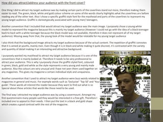
Attracting my target audience
- 1. How did you attract/address your audience with the front cover? One thing I did to attract my target audience was by making certain parts of the coverlines stand out more, therefore making them easier to read. The green, black, white and gold colour scheme on some of the words clearly highlights what the coverlines are before reading any of the other text. Also I chose a specific graffiti style font for the masthead and parts of the coverlines to represent my young target audience. Graffiti is stereotypically associated with young men/ teenagers. Another convention that I included that would attract my target audience was the main image. I purposely chose a young white model to represent the magazine because this is mainly my target audience (However I could not go with the idea of a black teenager back to back with a white teenager because the black model was not available, therefore it does not represent all of my target audience). Moving away from that, the young look of the model would be relatable for my young target audience I also think that the background image attracts my target audience because of the actual content. The repetition of graffiti connotes that it is aimed at youths, mainly men. Even though it is in black and white making it quite discreet, it’s contrasted with the variety and quantity of detail making it an interesting and attractive background. I purposely wanted my masthead to attract my target audience because it is one of the conventions that is mainly looked at. Therefore it needs to be very professional to attract your audience. This is why I purposely chose the graffiti styled font, coloured in green, black, gold and white as the style represents a very young and mainly male audience. Also the colours are very unusual and I have not seen them used together on any magazines. This gives my magazine a certain individual style and uniqueness. Another convention that I used to attract my target audience were buzz words related to magazines in general and music. For example words such as ‘Exclusive’ ‘Top 50’ and ‘Your guide’. These words all interest the reader because they want to find out what is so Special about these articles that words like these need to be used. The final way I attracted my target audience was by using a covermount. Amongst my first questionnaire many people said they would be interested in a free gift. Therefore I included one to appeal to their needs. I then put the text in a black and gold shape which creates a good contrast with the rest of the magazine.
- 2. How did you attract/address your audience with the Contents Page? One convention on the contents page which attracts my target audience would be the images, specifically the one about fashion. Generally, all R&B artists have a certain style and sense of fashion. Therefore I stereotyped my audience as some of their interests being fashion. Following this, they should be interest in this bit of content on the page. An optional code and convention to include in a music magazine is social media sites such as Facebook, Instagram and Twitter. I chose to include this convention because it would appear majorly to my target audience. As we know, there is the stereotype for teenagers that they are too obsessed with technology and also social media sites. Therefore this Instagram and Twitter information for my magazine would spread the name and brand. The fact that there is social media connotes that my magazine is mainly targeted at youths. Another way I tried to attract my audience was by highlighting the page numbers of where you can find the articles. This attracts the audience because of how much they stand out on the page. The contrast of the colour of the page numbers and the grey background means that the page numbers are more visible. In one of the articles, it talks about an artist releasing the top 50 R&B Songs of the year.This would interest my audience because they would be intrigued as to where certain songs they like have been placed in the chart. The final way my magazine attracts my target audience is through the actual articles. A few of them are talking about R&B artists, such as Usher, Robin Thicke, Justin Timberlake and Frank Ocean. These music artists have a big hold over a variety of people , including a lot of young audiences. Therefore if a young person were to look at some of these articles on the artists then they would mostly be attracted to the magazine.
- 3. How did you attract/address your audience with the Contents Page? The first typical convention I included on my double page spread is a grab quote. My grab quote has taken a sentence said by the interviewee, which has been enlarged and the font has been changed. This makes it vastly different to the article text meaning it will be one of the conventions you look at first due to the larger size. The actual words I chose to include are also key in attracting my audience. ‘It’ll be better than you expect’ is an intriguing sentence for media consumers because they do not know what he is talking about unless they read the article to find out. I also included a heading for the double page spread, so the audience can get a brief idea what the article is about. The heading colour is contrasted with my last two pages text in the way that my contents page and front cover are mainly green, whereas this is purple along with the article. Following this, it would be a change for the audience to have a different house style/ colour scheme. A drop cap is another convention I used to attract my audience. They are mostly included in magazines to show the start of an article. This is why I chose to include it in my magazine, but it also has the potential to attract my target audience through its larger font size compared to the article. Finally, the main image was used to attract my target audience. The fact that backgrounds aren’t often included on the main image of a double page spread means that I have broken this convention. Therefore this would intrigue and interest my audience as to why I have done this.