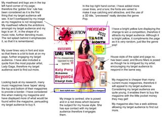
1. My masthead and logo are in the top left hand corner of my page; therefore the ‘golden line’ rule has been considered as it is the first thing that my target audience will see. It isn’t overlapped by my image as my magazine is not recognised. My masthead reflects the ambitions amongst my target audience and my logo is an ‘A’, in the shape of a music note, further denoting music. The red splash behind it emphasizes it, so that it is remembered. My cover lines vary in font and size so that there is a lot to look at on my page, further engaging my target audience. I have also included a quote from the most popular artist, Lady Gaga, therefore my target audience want to find out more. Looking back at my research, many music magazines have ‘tapes’ along the top and bottom of their magazines to provide a border. I have considered this when making my magazine and have displayed more of what would be found within the magazine, persuading my target audience to buy it. My magazine is cheaper than many current music magazines, therefore it will appeal to my target audience. Considering my target audience are quite young, it enables them to buy the magazine with the little pocket money they may get! My magazine also has a web address allowing my target audience to find out more. I have a bright yellow lure displaying the change to win a competition, therefore it attracts my target audience. Although it is bright yellow, it compliments the page as it is very random, just like the genre pop! In the top right hand corner, I have added more cover lines, and a lure; the fonts are varied to make it eye catching and attractive, and the use of a 3D title, “previewed” really denotes the genre Pop. My image is centred; she is posed and in a red dress which became the subject for my house style. She has eye contact with my target audience therefore it engages them. House style of the splat and page no. has been used, and Bruno Mars is posed as though he is intrigued by my artist, encouraging my target audience to respond in the same way.
2. The red splat illustrates my house style; the page number appear on top of it as opposed to my logo; therefore my target audience are aware that the pages link. In my research, I discovered a common layout that “Kerrang” and “Q” magazine uses; they have one main, square image at the top of their page, illustrating the main artist within the magazine. My contents title is big and eye catching; it informs the reader instantly and decreases the amount of pink on the page. My text varies in fonts, colour and size that each one stands out; therefore it becomes more eye catching and easier for readers to find the page they are looking for. I have included an editorial profile on my contents page; it have taken into account ‘mode of address’ to engage with my readers. To strengthen the bond, I have included a picture; and unlike many magazines, it Is not a serious photo; thus it is less harsh and threatening. I have included a photo of my front cover so that my target audience are aware that the 2 pages link. I have layered images on the right hand side to illustrate what my target audience will find within the magazine, encouraging them to read it. I have included my article within the contents page, and it is isolated in the corner so that it stands out from the rest of my contents page. I have dated my contents page using the same font as my “Contents” title, so that the issue is distinctive.
3. Continued house style for the page number; therefore my target audience are aware that this page links to my front cover and contents. I have included a quote on my DPS, which acts as a lure. It has been edited so that it looks like ‘STARR’ has crossed it out, and replaced “Music” with her name. This portrays teenage attitude, and makes the DPS more unique. Consequently it will encourage my target audience to read the interview. The quote is in a blue font, similar to the DPS title, so that it matches; it also adds balance to the page and they both appear in opposite corners. I have included a lure in the corner of my magazine; it is eye catching to attract my target audience, and advertises the article to encourage people to read it. It is in a pink font so that it continues my house style, and overlaps a graphitised star, further emphasizing the genre Pop. My image takes up the left hand side of my double page spread and she has direct eye contact to engage with any readers. My title is in a splat font, which is similar to my logo; therefore, it subtly continues my house style. It is very big and appears in the top right hand corner of the page; so when my target audience are casually flicking through pages, it stands out. I have included a brief introduction into the interview so that readers are aware of what it is about. My interview follows my house style as I have used the colour pink/red; the questions and answers are easily distinguished, aiding the youngest of my target audience. My interview finished with a slight enlarged, yellow quote which links nicely to the big blue one on the left hand side. I have included doodles as it is very ‘school girl’ and rebellious; this gives the DPS a personal touch.