
Recommended
More Related Content
What's hot
What's hot (15)
Viewers also liked
Similar to Choosing a genre
Similar to Choosing a genre (20)
More from asmediad14
More from asmediad14 (20)
Recently uploaded
Recently uploaded (20)
Choosing a genre
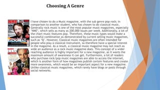
- 1. Choosing A Genre I have chosen to do a Music magazine, with the sub genre pop rock; in comparison to another student, who has chosen to do classical music. Generally rock music is one of the most popular music magazines, especially ‘NME‘, which sells as many as 200,000 issues per week. Additionally, a lot of the chart music features pop. Therefore, these music types would make a successful combination as demonstrated by current selling music magazines, such as ‘Q’. However, Classical music magazines are often intended for people who play a classical instrument, so therefore have a special interest in the magazine. As a result, a classical music magazine may not reach as wide an audience as a rock music magazine does. This concept of a wider reaching audience is highly important for a new magazine, as it wants the maximum amount of awareness it can get. Furthermore, a lot of readers who purchase rock/pop music magazines are able to access the internet, which is another form of how magazines publish certain features and create more awareness, which would be an important aspect for a new magazine. Unlike classical music magazines, which rarely have blogs or posts through social networks.
- 2. Choosing A Genre After completing my research into magazines with a similar genre to my various ideas, I have decided to focus on a combination of rock and pop music – pop-rock. Therefore, this will incorporate the tradition and success of a rock music magazine, whilst including the popular pop music updates and news. As highlighted by my research this combination has been and is currently successful, as ‘Q‘, a pop and rock music magazine, is one of the best selling music magazines, selling over 50,000 copies per month. It is important to know this combination could be successful, as it is necessary for a new magazine to be identifiable by a target audience, in order to create awareness. In relation to awareness, a lot of modern magazines, particularly rock and pop, use the internet to reach a wider target audience, which means my magazine would be able to use a similar form of technology to publish certain features and provide access to other readers, rather than just those who purchase a paper copy. Finally, because my magazine will be aimed at young adults/older teenagers, the sub-genre needs to be suitable for this age range. Thus, I need to be aware of what music is popular in the charts, as those who download music are usually of a similar age, which is why pop and rock will be an appropriate genre for an upcoming magazine, as the content will be recognisable by the target audience.
- 3. Choosing A Name Company – This title directly engages the reader, as it makes them feel part of the magazine. Likewise it reflects this idea that the magazine is the readers’ 'company’ and will act like their friend, providing them with the latest ‘gossip’ and news. MM (Music Matters) – This abbreviated title is similar to a number of other magazines, which highlights that I have researched into the codes and conventions of magazine design to see what layout is successful for different magazines. Abbreviations often make text more memorable, so that it can be easily identified by a target audience. In full, the title emphasises that music is the genre of the magazine and is a special interest not only for the readers but the writers too, illustrating that music truly does matter. Pop & Rock – This is a simple, yet obvious title, as it allows the target audience to clearly identify what the sub genre of the music magazine is. Therefore, the masthead will directly link to the magazines content, which will make it easier for music lovers to recognise whether the features will be appropriate to their music taste. Clash – This title represents the wild and crazy connotations of rock music, which almost portrays a sense of excitement to the audience. This sense of excitement would be appropriate for the youthful target audience. In addition, it highlights the combination or 'clash’ of music types, pop and rock, within the magazine. Illuminate – This title conveys imagery, which represents the lifestyle of its target audience, who most likely have an exciting night life. Therefore, it portrays the bright lights associated with parties and often pop music too. This imagery would give me an insight into what sort of colour schemes and font type would be suitable for my magazine, in order to develop a house style. It is this house style which is important for a magazine to become identifiable by a target audience, so that it ma become branded.
- 4. Choosing A Colour Scheme Red – Red is traditionally used by a variety of rock music magazines, such as ‘NME’ and ‘Q’. Therefore, by using red it would follow the codes and conventions of a rock music magazine. However, because I am producing a new magazine it may be better to use a different colour so that it may be identifiable as a unique and upcoming magazine. Even so, by following the traditional colours, the target audience will be able to recognise its sub-genre. Green – This is a relatively neutral colour, so would be appropriate for a target audience that involves both genders. Also, it is quite a bright colour and often bright colours are associated with pop music, as this type of music is typically associated with parties and dancing. Bright colours connote a positive persona, which is important for an upcoming magazine, as it will appeal to readers, encouraging them to purchase it. Sans Sariff – This font is typically used by the majority of magazines for the main text. Therefore, this would be recognised by readers, as it is important to follow the codes and conventions of magazine design. Also, it is important to sustain the same font throughout, in order to convey a sense of consistency. It is this consistency that builds a house style, so that a magazine is easily identifiable by its target audience. Once it becomes recognisable, a magazine may become branded. Masthead – For the masthead it is important to use a different font, which is bold, in order for it to be noticeable on the page, particularly on the cover. This will allow the magazine to be easily identified by its target audience. For example, ‘Britannic Bold’ presents a clear typography/title. The boldness represents the stand out sub-genre of the music, especially as it is a combination genre, rather than a specific focus on one music type.
- 5. Choosing An Article NME – this double page spread is a key example of how the designers have sustained their house style throughout the magazine. They have incorporated their key colour scheme, red and presented the main title in their usual angular block structure. This typography directly relates to the masthead, so that the article can be identified as an ‘NME’ article, without reading the masthead. It is this recognisability that allows a magazine to become successful, by becoming branded. Uncut – This article’s layout has an equal balance of images and text. I believe this is important to create an interesting and appealing article. Thus, an excess of text may appear boring and less relatable for the reader, as they may struggle to identify the link between the image and the text or they may not even be able to understand the story behind the feature. Whereas, too little text may not be identifiable as an article, but may give the impression of a poster. Therefore, it is important to present the right amount of text in order to provide the reader with a relevant story, which relates to the music magazine’s sub-genre and its target audience. Mojo – The colour scheme for this double page spread was influenced by the colour of the clothing worm by the person featuring in the article. This is a traditional way to form key colours, as it engages the images and text with the house style. This house style is important for allowing a magazine to become identifiable by its target audience, so that it may become branded. The typography and text also links to the plain background used in the image. This simplicity emphasises the blue used throughout the page, in order to highlight the main person in the feature.
- 6. Choosing An Article NME – this double page spread is a key example of how the designers have sustained their house style throughout the magazine. They have incorporated their key colour scheme, red and presented the main title in their usual angular block structure. This typography directly relates to the masthead, so that the article can be identified as an ‘NME’ article, without reading the masthead. It is this recognisability that allows a magazine to become successful, by becoming branded. Uncut – This article’s layout has an equal balance of images and text. I believe this is important to create an interesting and appealing article. Thus, an excess of text may appear boring and less relatable for the reader, as they may struggle to identify the link between the image and the text or they may not even be able to understand the story behind the feature. Whereas, too little text may not be identifiable as an article, but may give the impression of a poster. Therefore, it is important to present the right amount of text in order to provide the reader with a relevant story, which relates to the music magazine’s sub-genre and its target audience. Mojo – The colour scheme for this double page spread was influenced by the colour of the clothing worm by the person featuring in the article. This is a traditional way to form key colours, as it engages the images and text with the house style. This house style is important for allowing a magazine to become identifiable by its target audience, so that it may become branded. The typography and text also links to the plain background used in the image. This simplicity emphasises the blue used throughout the page, in order to highlight the main person in the feature.