1. Masthead - The masthead takes up just over the left third of
the top of the page. It is in red writing, with a white boarder,
and is in bold, block writing. The font is quite masculine, as
of the colour red is one that is associated with men
stereotypically more than women. The font being quite bold,
box like and compact, gives the masthead a modern feel,
suggesting the target audience of the magazine is young,
around the mid-twenties. All of the letters are in upper case,
as this is a convention of a magazine, to have upper case
characters on the front cover, therefore it stands out to an on
looking audience.
Main Cover Line – The main cover line of the article, is white with a black shadow
around it, and goes across the page, however, predominantly in the centre and is
across two lines. The lines are slightly tilted, which matched the tilted angle of the
main image, which creates anchorage for the photo, as well as the white font and
the models white t-shirt, therefore the audience knows that the main image is tied
to that coverline. By having the main coverline in white, it matches the red, black
and white colour scheme of the magazine, and stands out on the magazine, which is
quite multi coloured with the graffiti. By using the black shadow, it makes the main
cover line stand out from the other one on the right third and make the t-shirt not
blend in with the typography.
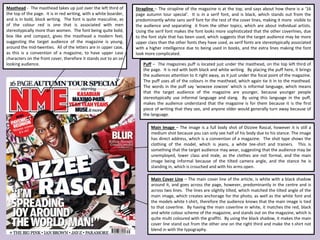
Main Image – The image is a full body shot of Dizziee Rascal, however it is still a
medium shot because you can only see half of his body due to his stance. The image
has direct address, which is a convention of a magazine. The shot type shows the
clothing of the model, which is jeans, a white tee-shirt and trainers. This is
something that the target audience may wear, suggesting that the audience may be
unemployed, lower class and male, as the clothes are not formal, and the main
image being informal because of the tilted camera angle, and the stance he is
standing in, which is crouched and with his arms open.
Strapline – The strapline of the magazine is at the top, and says about how there is a ‘16
page autumn tour special’. It is in a serif font, and is black, which stands out from the
predominantly white sans serif font for the rest of the cover lines, making it more visible to
the audience and separating it from the other topics, which are about individual artists.
Using the serif font makes the font looks more sophisticated that the other coverlines, due
to the font style that has been used, which suggests that the target audience may be more
upper class than the other fonts they have used, as serif fonts are stereotypically associated
with a higher intelligence due to being used in books, and the extra lines making the font
look more complicated.
Puff – The magazines puff is located just under the masthead, on the top left third of
the page. It is red with both black and white writing. By placing the puff here, it brings
the audiences attention to it right away, as it just under the focal point of the magazine.
The puff uses all of the colours in the masthead, which again tie it in to the masthead.
The words in the puff say ‘wowzee zowzee’ which is informal language, which means
that the target audience of the magazine are younger, because younger people
stereotypically use informal language and slang. By using this language in the puff,
makes the audience understand that the magazine is for them because it is the first
piece of writing that they see, and anyone older would generally turn away because of
the language.