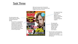
1. NME uses the same colour of red and the
identical san-serif for every masthead to push
forward a house style in this way.
Task Three
San-serif font is used again this
connotes a masculine brand
identify because of its strong
block-like style. However it is
pushed further forward still by
the use of yellow font and a
black background which causes
the font to pop forward.
The image of the Kings
of Leon artists is
intense and
aggressive, this re-enforces
a male brand
identity audience
conveyed through the
magazine
The haphazardly
placed images have
a polaroid style this
creates a concert
like effect, again
related to the
music industry.
The house style is continued with the
“Kings of Leon” font, the yellow colour
corresponds to the masthead
background, that in turn help the NME
font stand out.
The sharp boarders imply
hostility, again this is heavily
associate a male brand
identity.
2. A house style is created
through the use of a
constant colour, in this
case black backgrounds
with white text is used
with all titles, including
the sub sections. The
black and white colours
connote a chic look that is
also masculine due to its
dark colours.
This contents page is unconventional because it lacks
the literal title if contents, this is however not
uncommon for the indie genre, it is know for its
different style
Advertisements are seldom seen on a
contents page, usually they are seen
midway or at the back of the magazine.
This image is clearly from
a live performance, this
signifies that the readers
are interested in going out
and being sociable.
This informal language has a manly
register with vocabulary like”Boosh”
3. This image would definitely imply a
male brand identity, the rough
complexion of the subject connotes a
drinking culture plus the alcoholic
drinks he is holding are associated
more heavily with males
The background is
similar to that of a
country inn or pub,
this is very masculine.
This reinforces the
pub culture mode of
address.
This kicker creates a mode of address that
is repeated in the heading using the
orange colour.
The colour creates a meaning
that contradicts the word so the
orange word “good” is
contradictive because is not
usually a healthy colour
therefore it contradicts the
meaning of the word.
This pull quote produces the male mode of address because of
the casual and informal language “I’m like”.