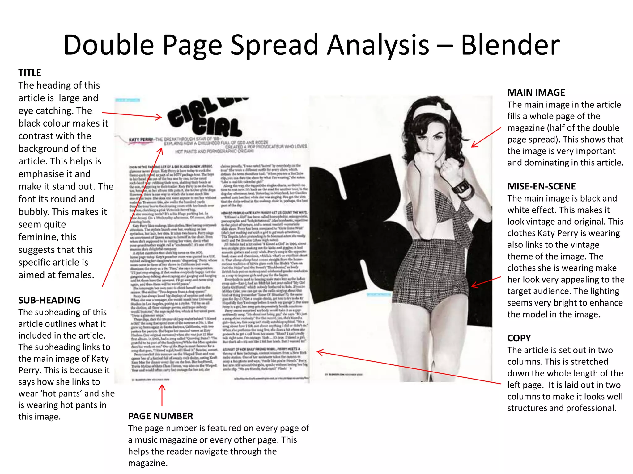
1) The main image takes up the entire double page spread and features Katy Perry wearing vintage-inspired clothing to match the black and white aesthetic.
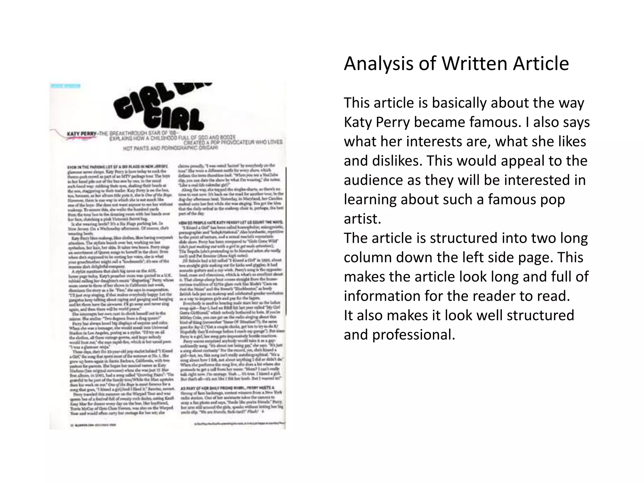
2) The article uses a two-column layout to provide a structured and informative breakdown of Katy Perry's rise to fame and her interests.
3) Details like the page number help readers navigate through the magazine and easily find the article.