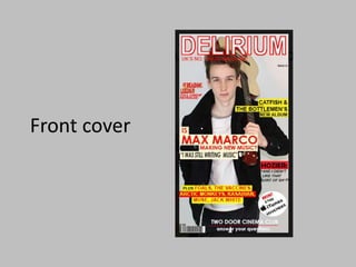
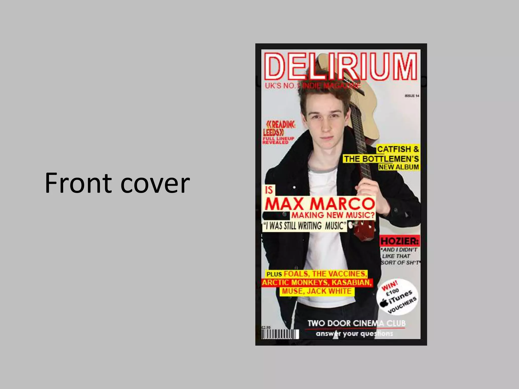
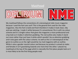
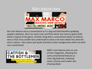
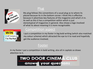
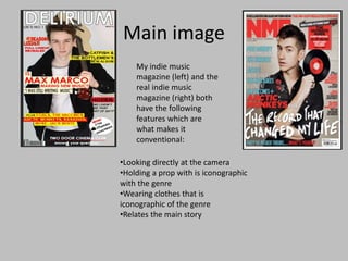
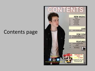
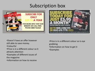
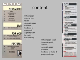
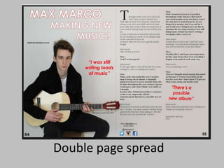
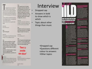
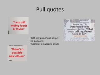
Front cover
Masthead
My masthead follows the conventions of a stereotypical indie music magazine
because I used the font sans serif. This is the general font used for the indie
magazines. Also the font is bold and fresh therefore it makes it look clean, tidy
and eye catching. I made it white because it’s conventional, fits in with my colour
scheme and it’s a bright colour that gives the magazine a more professional and
crisp look so it makes it attention grabbing. The red outline also makes it stand
out more rather than just have it white which wouldn't be as attention grabbing
and it also goes with the colour scheme. As well as this is it stereotypical of the
genre to outline as on the right would be my rival magazine with an outline.
White is also a gender neutral colour and because my product is aimed at males
and females it isn't gravitating towards one more than the other. I placed my
masthead at the top of the page which is naturally the first place people look so it
is most likely to be the first thing people read.
Main feature story
My main feature story is conventional as it is big and bold therefore grabbing
people’s attention. Also I've used a sans serif font which was Century gothic bold
which is typical of the genre. Another thing that is conventional about my feature
story is that it has smaller text underneath to show a bit more detail into what the
story is about. I also used a pull quote and block colour backgrounds which are both
very conventional
NME’s main feature story on one
of their magazines. Showing the
same conventional features as
mine; big bold text, matching
colour scheme and smaller text
showing detail.
Plug
My plug follows the conventions of a usual plug as to where its
placed because its in the bottom corner. I think this is effective
because it advertises key features of the magazine and what’s it in.
As well as this it has a competition within which is just
stereotypical of magazines in general. Also shows a logo involved
of what its about meaning it is more recognisable.
Competition aspect
I put a competition in my footer in big bold writing (which also matched
my colour scheme) which attracted the eye to it to read and hopefully
get the audience involved.
Footer
In my footer I put a competition in bold writing, also all in capitals so draws
attention to it.
Main image
•Looking directly at the camera
•Holding a prop with is iconographic
with the genre
•Wearing clothes that is
iconographic of the genre
•Relates the main story
My indie music
magazine (left) and the
real indie music
magazine (right) both
have the following
features which are
what makes it
conventional:
Contents page
Subscription box
•Doesn't have an offer however
still able to save money.
•Colourful
•Price is in a different colour so it
attracts attention
•Examples of different issues of
the magazine
•Information on how to receive
•Price is in a different colour so is eye
grabbing
•Information on how to get it
•Examples
content
•Information
on most but
not all
•Accurate page
numbers
•Sections to
separate it
•A photo with
the main
feature story
•Information on all
•Large range of
sections
•Accurate page
numbers
•Sections to make it
less complicated
Double page spread
Interview
• Dropped cap
• Answers in bold
to show which is
which
• Topic about other
things than music
•Dropped cap
•Questions different
colour to answers
•Other topics
Pull quotes
•Both intriguing and attract
the audience.
•Typical of a magazine article

Question 1

  • 1.
  • 2.
    Masthead My masthead followsthe conventions of a stereotypical indie music magazine because I used the font sans serif. This is the general font used for the indie magazines. Also the font is bold and fresh therefore it makes it look clean, tidy and eye catching. I made it white because it’s conventional, fits in with my colour scheme and it’s a bright colour that gives the magazine a more professional and crisp look so it makes it attention grabbing. The red outline also makes it stand out more rather than just have it white which wouldn't be as attention grabbing and it also goes with the colour scheme. As well as this is it stereotypical of the genre to outline as on the right would be my rival magazine with an outline. White is also a gender neutral colour and because my product is aimed at males and females it isn't gravitating towards one more than the other. I placed my masthead at the top of the page which is naturally the first place people look so it is most likely to be the first thing people read.
  • 3.
    Main feature story Mymain feature story is conventional as it is big and bold therefore grabbing people’s attention. Also I've used a sans serif font which was Century gothic bold which is typical of the genre. Another thing that is conventional about my feature story is that it has smaller text underneath to show a bit more detail into what the story is about. I also used a pull quote and block colour backgrounds which are both very conventional NME’s main feature story on one of their magazines. Showing the same conventional features as mine; big bold text, matching colour scheme and smaller text showing detail.
  • 4.
    Plug My plug followsthe conventions of a usual plug as to where its placed because its in the bottom corner. I think this is effective because it advertises key features of the magazine and what’s it in. As well as this it has a competition within which is just stereotypical of magazines in general. Also shows a logo involved of what its about meaning it is more recognisable. Competition aspect I put a competition in my footer in big bold writing (which also matched my colour scheme) which attracted the eye to it to read and hopefully get the audience involved. Footer In my footer I put a competition in bold writing, also all in capitals so draws attention to it.
  • 5.
    Main image •Looking directlyat the camera •Holding a prop with is iconographic with the genre •Wearing clothes that is iconographic of the genre •Relates the main story My indie music magazine (left) and the real indie music magazine (right) both have the following features which are what makes it conventional:
  • 6.
  • 7.
    Subscription box •Doesn't havean offer however still able to save money. •Colourful •Price is in a different colour so it attracts attention •Examples of different issues of the magazine •Information on how to receive •Price is in a different colour so is eye grabbing •Information on how to get it •Examples
  • 8.
    content •Information on most but notall •Accurate page numbers •Sections to separate it •A photo with the main feature story •Information on all •Large range of sections •Accurate page numbers •Sections to make it less complicated
  • 9.
  • 10.
    Interview • Dropped cap •Answers in bold to show which is which • Topic about other things than music •Dropped cap •Questions different colour to answers •Other topics
  • 11.
    Pull quotes •Both intriguingand attract the audience. •Typical of a magazine article