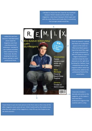
1. I decided to choose the font I have for my masthead
because I think it stands out from other music
magazines. I also chose it because I think it goes well
with the music theme and it looks like it is something
that younger people would like.
I added this text here
because I had dead space
which made the
magazine cover look
unprofessional and
unfinished. I decided to
use a yellow and white
colour scheme on the
front cover. By only
keeping the text two
colours, giving it a more
professional finish.
From my research i noticed
that there are no big blank
spaces on the cover so i
filled some blank spaces i
had at the top of the page
by using a promotion to
'Win VIP tickets to meet DJ
Rogers' furthermore I
wanted to keep the main
elements on the right third
by doing this i believe i have
imitated the work of real
magazine editors which has
subsequently added to the
professional finish of the
overall piece
I have also included a
barcode and a price on the
magazine, as this makes it
look more like a
professional magazine that
could be sold in a shop
I have chosen to put one main picture on the front cover as this is how all the
other magazine covers were set out, I think it works well as the readers know
what the main subject of the magazine is, it also fills up a lot of space so you
can work around it.