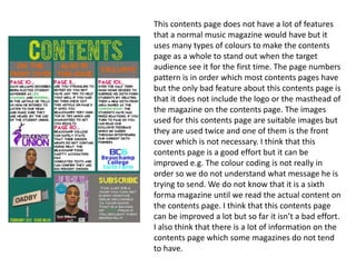
1. This contents page does not have a lot of features
that a normal music magazine would have but it
uses many types of colours to make the contents
page as a whole to stand out when the target
audience see it for the first time. The page numbers
pattern is in order which most contents pages have
but the only bad feature about this contents page is
that it does not include the logo or the masthead of
the magazine on the contents page. The images
used for this contents page are suitable images but
they are used twice and one of them is the front
cover which is not necessary. I think that this
contents page is a good effort but it can be
improved e.g. The colour coding is not really in
order so we do not understand what message he is
trying to send. We do not know that it is a sixth
forma magazine until we read the actual content on
the contents page. I think that this contents page
can be improved a lot but so far it isn’t a bad effort.
I also think that there is a lot of information on the
contents page which some magazines do not tend
to have.
2. This contents page is also a sixth form
magazine contents page and this is a lot
interesting because they have colour coded
the texts into two colours which are white and
black, with the background being grey. These
three colours go well with each other as they
are really close colours. The image they have
used is not suitable I think because the person
in the middle is not looking at the camera
which is breaking the rules of magazine
construction. The way they have structured the
contents page is excellent i think because it
makes it look neat and i think that when the
target audience will open the page after the
front cover they will think that this whole
magazine is going to be neatly structured and
it will be easy to find information. Overall i
think that this contents page is better than the
one that i analyzed before.
3. This is a original contents page made by
professional editors and creators. This a
lot different form the student magazine
but the rules and regulations used are
similar e.g. They all have numbers.
However this contents page is a lot
different compared to the student
magazines because they do not have sub
titles on their contents pages where as
this one does. The other magazines are
not really colour coded where as this
music magazine comes every month and
every month this the contents page is the
same colour which differentiates this
contents page from all the others.
Contents pages also have advertisements
or some types of competitions going on
which this magazine has but the two
student magazines that I analyzed do not
have these type of features.