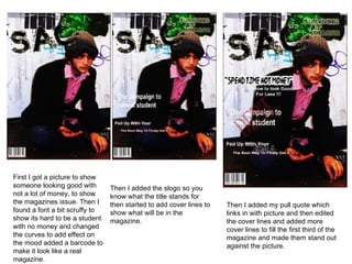
1. First I got a picture to show someone looking good with not a lot of money, to show the magazines issue. Then I found a font a bit scruffy to show its hard to be a student with no money and changed the curves to add effect on the mood added a barcode to make it look like a real magazine. Then I added the slogo so you know what the title stands for then started to add cover lines to show what will be in the magazine. Then I added my pull quote which links in with picture and then edited the cover lines and added more cover lines to fill the first third of the magazine and made them stand out against the picture.
2. First I added the title of the magazine in with ‘content’ so you no what it is like then added a paint splat which I I was inspired by other magazines and changed the main colour to purple and changed the curves . I added what will be in my magazine and changed the colour so it would stand out and match the title and left room for my pictures. Finally I added my pictures to relate what is in the t magazines and relates to the contents I faded round the edges to blend in and changed most of the picture black and white to make the rest of the colour to stand out and the main colours are the blacks and purple.