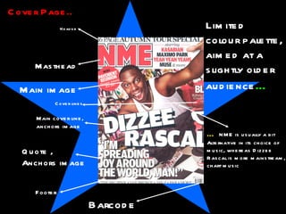
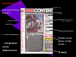
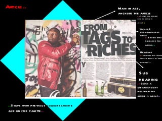
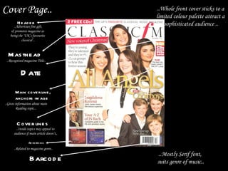
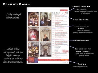
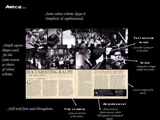
2. Header Main image Masthead Main cover line, anchors image Quote , Anchors image Cover Page.. Limited colour palette, aimed at a slightly older audience … … NME is usually a bit Alternative in its choice of music, whereas Dizzee Rascal is more mainstream, chart music Footer Barcode Cover lines
3. Contents Page.. Image anchors text Flash Consistent Colour Scheme … Date States main focus of the Issue .. Highlights subject of each Section - subheading … Plain background ... ... Serif font used throughout ... Limited colour palette still … Title
4. Article.. Main image, anchors the article Headline Sub heading .. Gives a greater insight into what the article is about .. .. Shows you visually who the article is about .. .. changes the saying ‘rags to riches’ to ‘tags to riches ’ .. .. Stays with previous colour scheme and limited palette .. Author & photographer of article .. Shows who produced the article ..
5. Target Audience.. NME mainly attracts male readers, specifically between the ages of 16 & 24. 79% of NME readers fall into the A/B/C1 category, making it read by on the whole middle class readers. Readers are often passionate about their music, and the NME website itself is the biggest and most viewed website in Europe. It offers it’s relatively younger audience a unique opportunity to access music that suits their taste on a regular basis.
6. Cover Page.. Header .. Shows a quote & a real life story .. .. Gives the name of the magazine, so it is widely recognised .. Masthead Show’s it is a part of the BBC .. Show it is a trusted corporation .. Main Image .. Shows a current band – attracts attention to the magazine from fans .. Text anchors image .. Exaggerates topic to make it sound more readable .. Issue & Date number Barcode Shows what’s inside the issue
7. Contents Page.. Title Shows what was on the front cover Subheading for specific articles Points out main page numbers Image anchors page number .. Limited colour palette .. .. Bright colours, aimed at younger audience .. .. Mainly serif font used .. .. Plain white background ..
8. Article.. Main image, anchors the article Quote , from article Recognisable logo Quote from article, used as headline Competition Image anchors text .. Bright colours, still used .. .. Flashy background Keeps readers entertained, ..
9. It is a monthly magazine aimed primarily at younger teenage girls, It’s published by the BBC, and includes chart information, beauty Advice, quizzes and song lyrics and is a supplementary magazine For the TV show ‘Top of the Pops’ It was first launched in February 1995, andis famous for giving The Spice Girls their nicknames. Its editors have included Peter Lorraine, Corinna Schaffer and Rosalie Snaith. Target Audience. .
10. Cover Page.. Header Masthead Main cover line, anchors image Barcode Date Cover lines Advertising ..Advertises free gift, & promotes magazine as being the ‘UK’s favourite classical’.. ..Recognised magazine Title.. ..Mostly Serif font, suits genre of music.. ..Gives information about main Reading topic... ..Related to magazine genre.. ..Inside topics may appeal to audience if main article doesn’t,, ..Whole front cover sticks to a limited colour palette attract a sophisticated audience ..
11. Contents Page.. Issue Number Shows main topics in the magazine Images anchor text Footer Subheadings for main sections Shows Classic FM logo again ..Shows an offer that’s on.. ..Points out what will probably be the most read articles.. ..Remind audience it’s recognised source of information.. ..Again, points out main sections, points of interest.. ..Sticks to simple colour scheme.. ..Plain white background, not too bright, average reader won’t have a low attention span..
12. Article.. Text anchors image ..Says what’s going on in the photo.. Title of article ..Gives an overview of the article.. ..Image gives a bigger Insight into article.. Image Advertisement ..Shows items of Similar interest, which Will appeal to stereotypical Reader. ..Same colour scheme, keeps it Simplistic & sophisticated.. ..Gives a sample of the article.. ..Simple square shapes used, for the Same reason as choice of colour scheme.. ..Still serif font used throughout..
13. Target Audience.. It is a monthly magazine published in the United Kingdom each month. It often includes a cover disc, and discusses live performances etc.