
Recommended
More Related Content
What's hot
What's hot (20)
Similar to Poster production
Similar to Poster production (20)
Recently uploaded
Recently uploaded (20)
Poster production
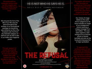
- 1. We positioned our actresses names under our film’s tagline and spaced the lettering out to make it stand out more. Our tagline will induce fear amongst our audience as it insinuates you cannot always trust people online – which links to the cyber horror subgenre our target market is so familiar with. Our choice of image relates to the cyber horror subgenre as we have included an image of our protagonist’s phone receiving a creepy message from her stalker. This was taken against a dark background so that the phone is framed centrally and acts as the focal point because this is major symbolism. We ensured the font of the title of our film was the same throughout the entirety of our promotional package so everything was cohesive so this is the ‘Cracked code’ font from the distorted category on DaFont.com as that is also in our trailer and magazine poster. Through research of similar films that fall under similar categories as ours (psychological thrillers and cyber horrors) we have decided to rate our film a 15. It is suitable for a teenage audience. To approach the professionalism of real media texts we followed a similar format of including our production company logo, the Warner brothers logo (an entertainment company) and relevant information beside it (the actresses, the producer, the director, the cinematographer).
- 2. To achieve the glow effect on our film’s tagline (‘HE IS NOT WHO HE SAYS HE IS.’) we selected a simplistic font from Photoshop ,change the colour to white, rasterize the type, duplicate 3 layers, open the motion blur in the filter tab, change dimensions of angle from 0 to 90 degrees and distance to 150 then play around with the layers until the desired effect is achieved.