
Recommended
More Related Content
What's hot
What's hot (20)
Similar to Final Task
Similar to Final Task (20)
More from Smilte Eva Eidininkaite
More from Smilte Eva Eidininkaite (6)
Recently uploaded
Recently uploaded (20)
Final Task
- 1. FINAL TASK: STEP BY STEP EDITING PROCESS – GLITCH OPENING TITLES ON AFTER EFFECTS…
- 2. WHAT DO I WANT TO ACHIEVE AND HOW? From my previous research I've indicated my interest in the VHS style of video editing, and so I've made further attempts to discover how this particular style is achieved. All old VHS videotapes seem to have a 4:3 (1:33:1) aspect ratio, the first number indicates the width of the screen and the second number indicates the height, which is pretty simple, so for every 4 inches in width, there will be 3 inches in height. Over a century ago, the classic Hollywood films would typically project this aspect ration on screen, on a standard film strip. However since the 1950s the widescreen became more popularised with an increased aspect ratio of 2:59:1 by the Cinerama company in 1952, and another film company named CinemaScope also managed an aspect ratio of around 2:35:1. MGM then launched MGM 65 which gave an even bigger aspect ratio of 2:76:1, and so set a preference amongst audiences for widescreen aspect ratios, especially a the film industry became more modernised, now films typically use aspect ratios ranging between 1:85:1 to 2:39:1, however the 16:9 aspect ratio was settled upon by television in the 1980s to present widescreen cinematic films, before this however there was the ‘pan and scan’, a VHS look on television that would crop integral aspects of a widescreen letterbox film, because they simply couldn’t not fit the bigger aspect ratio of film onto most household televisions with a 4:3 aspect ratio. However some films today don’t like to follow the trend and instead choose the original 4:3 aspect ratio, films such as The Grand Budapest Hotel (2014) and Fish Tank (2009), which shows that using the 4:3 original aspect ratio is growing in popularity and is more or less associated with old cinema or VHS tapes. Therefore I will try to achieve the 4:3 aspect ratio on my final task.
- 3. 3 4 1 2.39
- 4. Furthermore VHS tapes, typically contain some aspect of distortion, as if the video itself was broken, impractical and outdated for modern use (see video example 1 and 2). The I have presented as an example also shows glitch effects, therefore I will try to integrate these effects into my final task to add a sense of realism but to also have an equally effective way to present my opening titles to the audience, since I have not seen this done on any film or video on a social media platform that I can find. I can easily do this by downloading VHS glitch stock footage online and integrating it into my editing process, where I want smooth transitions from one clip to another. I will also make my video have a relatively low quality look, to enforce how old and outdated the video clip really is, in order to add a sense of realism to my video again. This has been done countless time through film, old VHS tapes have a gritty, almost imbalanced look to them, like in The Blair Witch Project (1999) which plays heavily with saturation and contrast between shades and colours (see video example 3). So I will do this utilising many functions and tools in After Effects, such as adjusting the colour, brightness and blur ratios within the composition. Lastly I want to distort the sound as equally as I distort the style of the footage through editing, I definitely want there to be a heavy base sound that becomes almost incomprehensible during the end of the composition, to signify that the tape is almost falling apart whilst the audience are watching, there will be a slow increase in volume instead of a high-pitch discomforting sound instantly beginning within my video,(see video example 4). Furthermore static sounds will be included to compliment the breaks in footage to accommodate my opening titles alongside the static glitches in footage. I will do this by slowly increasing the volume in Premier Pro, since volume levels cannot be controlled in After Effects.
- 5. STEP BY STEP EDITING PROCESS: PART 1, (SEE VIDEO EXAMPLE 5)
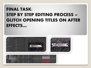
- 6. To achieve my glitch title effects, I first needed to import glitch stock footage I had downloaded, and insert that footage into my composition.
- 7. This is what the raw footage looked like, before it was imported onto my composition and used for my glitch titles.
- 8. After the glitch stock footage was imported onto my composition, I then began with adding a new adjustment layer. Adjustment layers are extremely useful because you can add certain properties to that adjustment layer, which effects your quality and appearance overall.
- 9. Onto that newly created adjustment layer I then add a displacement map, by going to, 1. Effects 2. Distort 3. Displacement Map. Displacement maps essentially displace or move the pixels of a target image or text, they are useful for providing texture and depth by distorting an image or text so different parts appear to be at different levels.
- 10. Next under the displacement map layer, I selected by imported glitch stock footage, essentially the stock footage will skew and distort my opening title and the displacement map will help me control this distortion when I adjust the horizontal and vertical displacement.
- 11. Text is now slightly distorted upwards. Text is also slightly distorted sideways.
- 12. STEP BY STEP EDITING PROCESS: PART 2
- 13. Next I wanted to move on to the colour of my text, by creating distorted layers like to give a retro VHS effect. I duplicated my text and named each new layer the following, so that I could apply those specific colours to one layer of the text, however I later changed my mind when the VHS themed blue, green, and red text didn’t match the overall light soft colours of my composition. (R) – Red (B) – Blue (G) – Green
- 14. Then under the Effects and Precepts tab, I searched for Levels (Individual Controls) which allowed me to control the colour concentration of my text, and I then applied that effect to each of the three text layers I created above.
- 15. Firstly I started with my Red layer, and through individual controls I changed the Output White setting for Green and Blue to the value of 0 and kept the original Output White value of 255.0 the same for the Red, in order to make the red layer I had created, RED, since the Green and Blue colours wont be present if their Output White has a 0 value. I then repeated this step for the Green and Blue text layers. Colour Levels 3 Colour Channels
- 16. As I've explained, the colours (red, blue and green) seemed too vibrant to suit the more softer colour palette of my composition, which also had warm pink undertones, so I played around with the colour levels and realised I could make the colours more softer and less noticeable.
- 18. I then changed the Transfer Mode of the blue and green text layers to Screen, so that the layers can be offset and through manipulation appear how I want them to.
- 19. These colour channels are now visible in the text, the red has now become pink. A light blue tint is visible at the bottom of the text, indicating that the blue layer is underneath the red one. The green layer is very faint, because I've changed the colour levels quite drastically for the green as there was more of a prevalence of the colours blue and pink in the overall colour palette of my composition, and I felt like green would create some inconsistency, but it still creates texture.
- 20. STEP BY STEP EDITING PROCESS: PART 3
- 21. Next I wanted to develop the glitch effect by creating an RGB split, this is when by red text layer would move slightly around the composition to give a distortion effect. I did this by creating a Null Layer first by clicking on, 1) Layer 2) New 3) Null Layer Null Layers can control multiple layers and create complex animations, its also not a visible element in the composition, a Null Object is an invisible layer that has all the properties of a visible layer so that it can be a parent to any layer in the composition, it allows controlling of other layers using a non-visible object layer.
- 22. I then renamed this layer to RGB Split and applied the Slider Control under Expression Controls.
- 23. Next, I selected the red text layer, since this was going to be the layer I would distort and slightly shift around the composition, I hit P, for Position, then Alt click so that a text bar becomes exposed. I then typed the following (the value depends on how extreme you want the distortion effect to be or how much space you have in your composition)
- 24. Next, I selected the Pick Whip tool, which is made to create expressions you don’t want to enter manually in a text field, and attached it to the Slider Control.
- 25. Now I'm able to use the Slider Control to adjust the position of the red text layer. I've also exposed the key frames of the Slider Control, this gave me the ability to control what position the red text layer will be at certain times in the composition.
- 26. STEP BY STEP EDITING PROCESS: PART 4
- 27. Finally I added actual glitch effects onto my opening titles, that only last for a very short duration in the sequence. I started again by creating another Adjustment Layer.
- 28. Next, I selected the Bad TV 3 – Weak effect from the Effects and Precepts tab, and applied it to my adjustment layer. This then gave me the ability to mask out a portion of the title that I wanted to exhibit a glitch effect.
- 29. I then repeated this technique several times.
- 30. All the parts I've just explained compromise of one of these, I essentially repeated all the steps above for all of the 6 remaining opening titles in the entire 2 minute sequence.
- 31. COMPARISON: FINAL TASK VS EXAMPLE
- 32. There are some obvious stylistic differences when I compare by opening title with the more retro 80s themed titles, specifically my titles lack more brighter neon colours, this is because I wanted the colours to suit the more softer colour palette presented throughout my sequence which consisted of warmer blue, pink and brown colours, to have bright greens and yellows would've made my sequence appear less consistent with style, however looking at the clear comparison I think that maybe making my colours brighter would've definitely made an improvement to the VHS style I tried to replicate. Furthermore the font from example B and C seem to have a more digital style to their typography whereas mine seems to be modern yet less futuristic. However there are layers of different colours in my typography which is commonly used in VHS titles to add texture and to make the titles seem more malfunctioned and broken. Furthermore I've decided to add more static TV glitch effects that last for a very short span of time for realism. B C A