Download to read offline
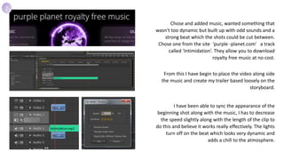
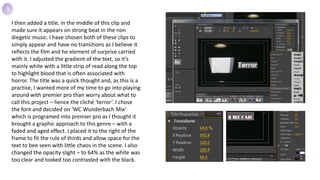

1. The document describes the process of creating a preliminary trailer experimenting with Adobe Premier Pro. Various editing techniques were used including adjusting clip speeds, adding titles, color corrections, and transitions. 2. Key elements like music, shots, and titles were selected and edited to sync with the beat and create suspense. Shots were sped up or slowed down and colors were desaturated to achieve a horror-like tone. 3. Different editing techniques were tested out including jump cuts, flash effects, and motion tracking to refine the trailer. Text was overlapped and faded between to introduce a smoother transition. 4. The goal was to focus on layout and effects first before finalizing quality settings


![[REC] poster analysis](https://cdn.slidesharecdn.com/ss_thumbnails/recposteranalysis-130307143012-phpapp02-thumbnail.jpg?width=640&height=640&fit=bounds)


