1. The headline is in bold font,
enlarged and positioned on
the top left, this is to catch the
readers eye. It is short and to
the point, it gives an idea of
the programmes genre.
There is a stand first used to
summarise the key point, it
is used to lure the reader in,
and engage the reader. This
uses rhetoric features e.g.
questions and alliteration.
The chefs name is
emphasized in bold to also
catch the audience’s eye.
Those interested will have
known of the name and be
drawn in because he is
featured.
A byline is used to
state who the article is
written by, it is a
typical convention of a
double page spread.
The article is clearly
laid out so that the
reader can follow it, it
is also aesthetically
pleasing. Columns are
the same width and
positioned across the
two pages. This leaves
little empty space on
the page
The date, time, channel and name of the programme
is always listed on the top left corner; above the
corner.
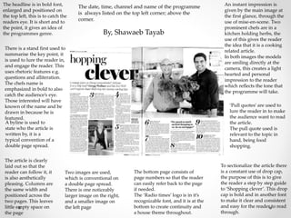
Two images are used,
which is conventional on
a double page spread.
There is one noticeably
larger image on the right,
and a smaller image on
the left page
The bottom page consists of
page numbers so that the reader
can easily refer back to the page
if needed.
The ‘Radio times’ logo is in it’s
recognizable font, and it is at the
bottom to create continuity and
a house theme throughout.
An instant impression is
given by the main image at
the first glance, through the
use of mise-en-scene. Two
prominent chefs are in a
kitchen holding herbs, the
use of this gives the reader
the idea that it is a cooking
related article.
In both images the models
are smiling directly at the
camera, this creates a light
hearted and personal
impression to the reader
which reflects the tone that
the programme will take.
‘Pull quotes’ are used to
lure the reader in to make
the audience want to read
the article.
The pull quote used is
relevant to the topic in
hand, being food
shopping.
To sectionalize the article there
is a constant use of drop cap,
the purpose of this is to give
the reader a step by step guide
to ‘Shopping clever’. This drop
cap is bold and in another font
to make it clear and consistent
and easy for the reader to read
through.
By, Shawaeb Tayab