Download to read offline
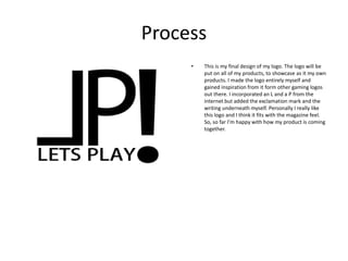


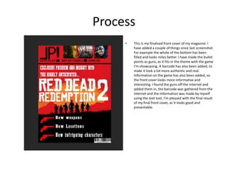


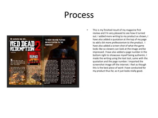
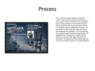


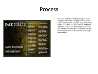


Joseph created a logo for his magazine products incorporating an L and P from online sources along with additional custom elements. He then began designing the magazine cover, adding the logo, title, image and other details. By the next screenshot, the cover was nearing completion. Joseph continued designing interior pages like the contents page and several game reviews. He found images online and wrote custom text for reviews. Joseph refined the layout over multiple iterations. The final magazine included a cover, contents, and several game reviews with images, ratings and Joseph's thoughts. He was pleased with the professional appearance and timing of completing the project.